🛠 Design Services
I provide work opportunities in three core areas: value discovery,
MVP development, and product launch.
MVP development, and product launch.
✅ Validate
Value Discovery & Testing
I will help you test your idea and its core assumptions while rapidly iterating it in the market.
• User Research
• Idea Validation
• Idea Validation
🛠 Build
Minimal Viable Product
Crafting the simplest possible product that holds and provides the essential value required to succeed.
• Web Applications
• Mobile Application
• Mobile Application
🔉 Launch
Branding & Launch
Once you have a product offering, you will need a strong brand and appropriate launch strategy to succeed.
• Marketing Website
• Launch Strategy
• Launch Strategy
🎓 Design Mentorship
If you're looking for design mentoring, whether it be for user research, prototyping, UI/UX, or launch, sign up for a session here:
Thank you! Your submission has been received!
Oops! Something went wrong while submitting the form.
🧰 Design Resources
If you're looking for design resources or classes, gain access to all the content at Killer Interactions, my design resource hub
Thank you! Your submission has been received!
Oops! Something went wrong while submitting the form.
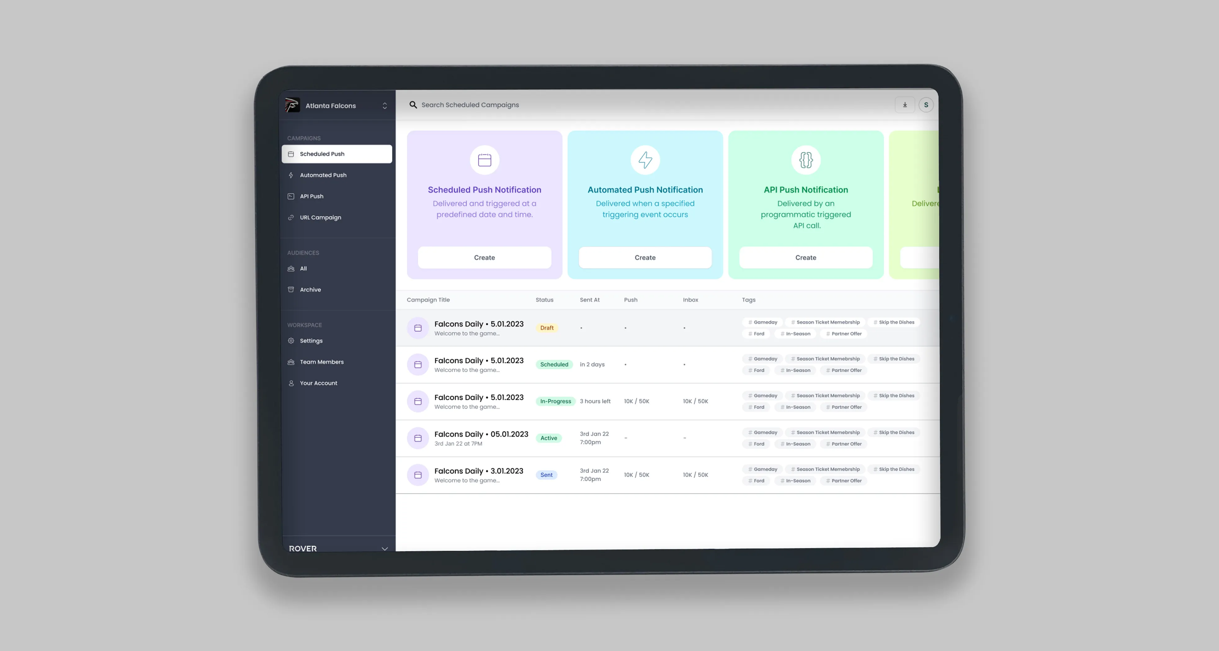
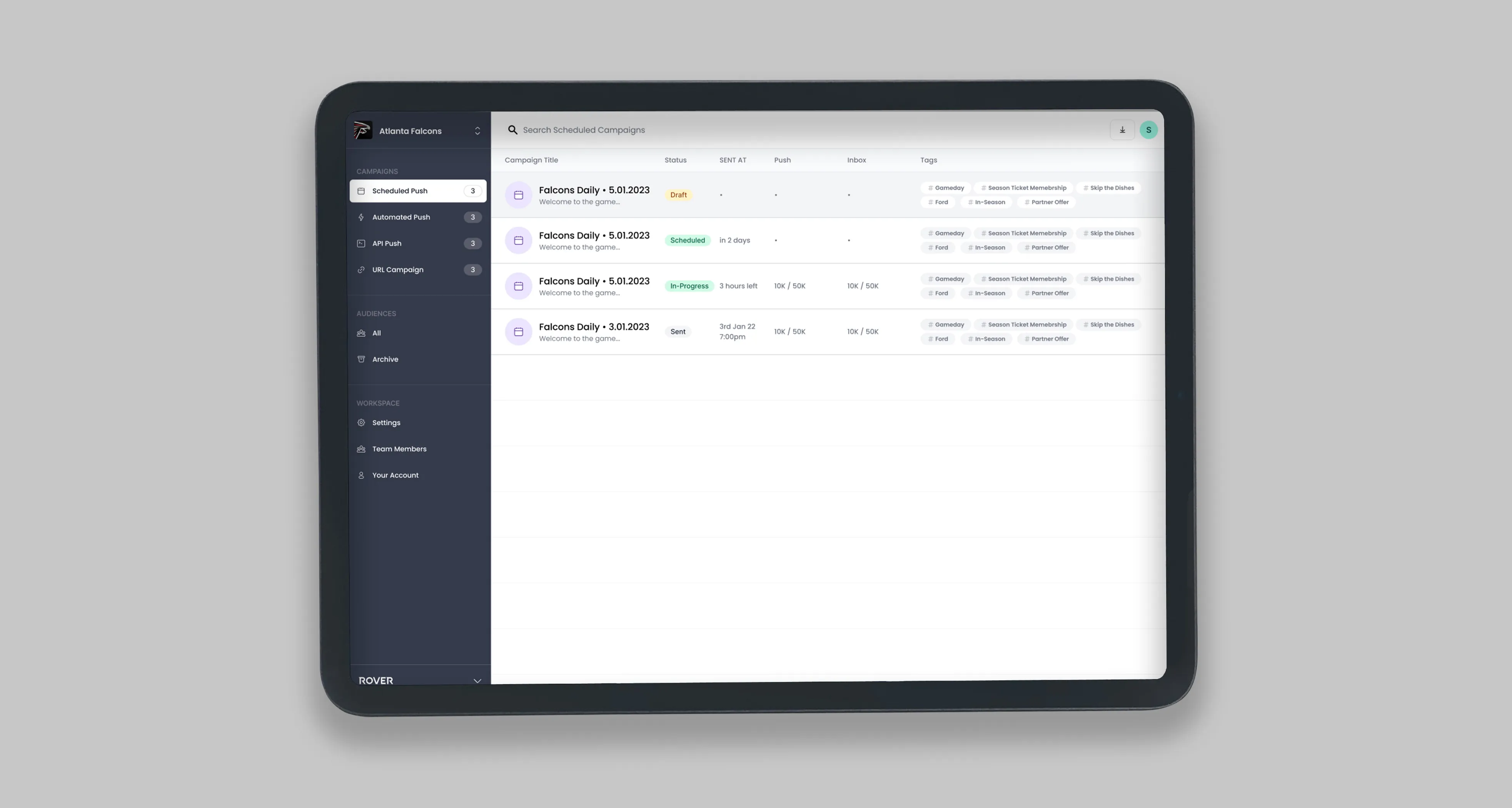
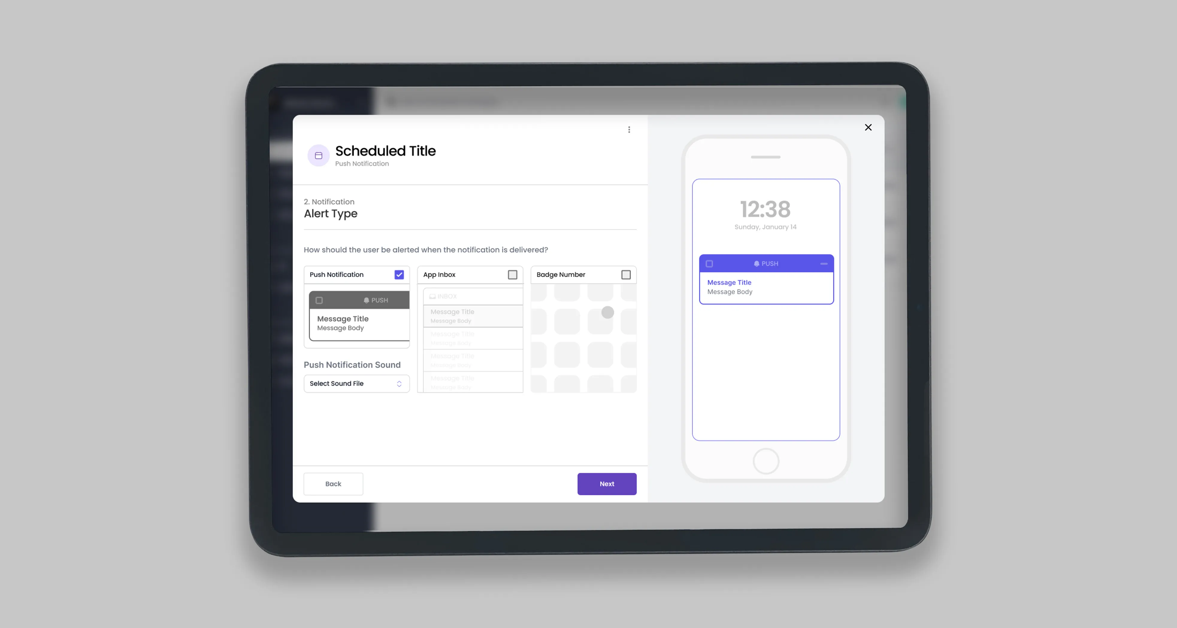
#01 • Rover | B2B Web-Application
"Allows sporting teams to push and manage notifications as real time embedded inside IOS applications"
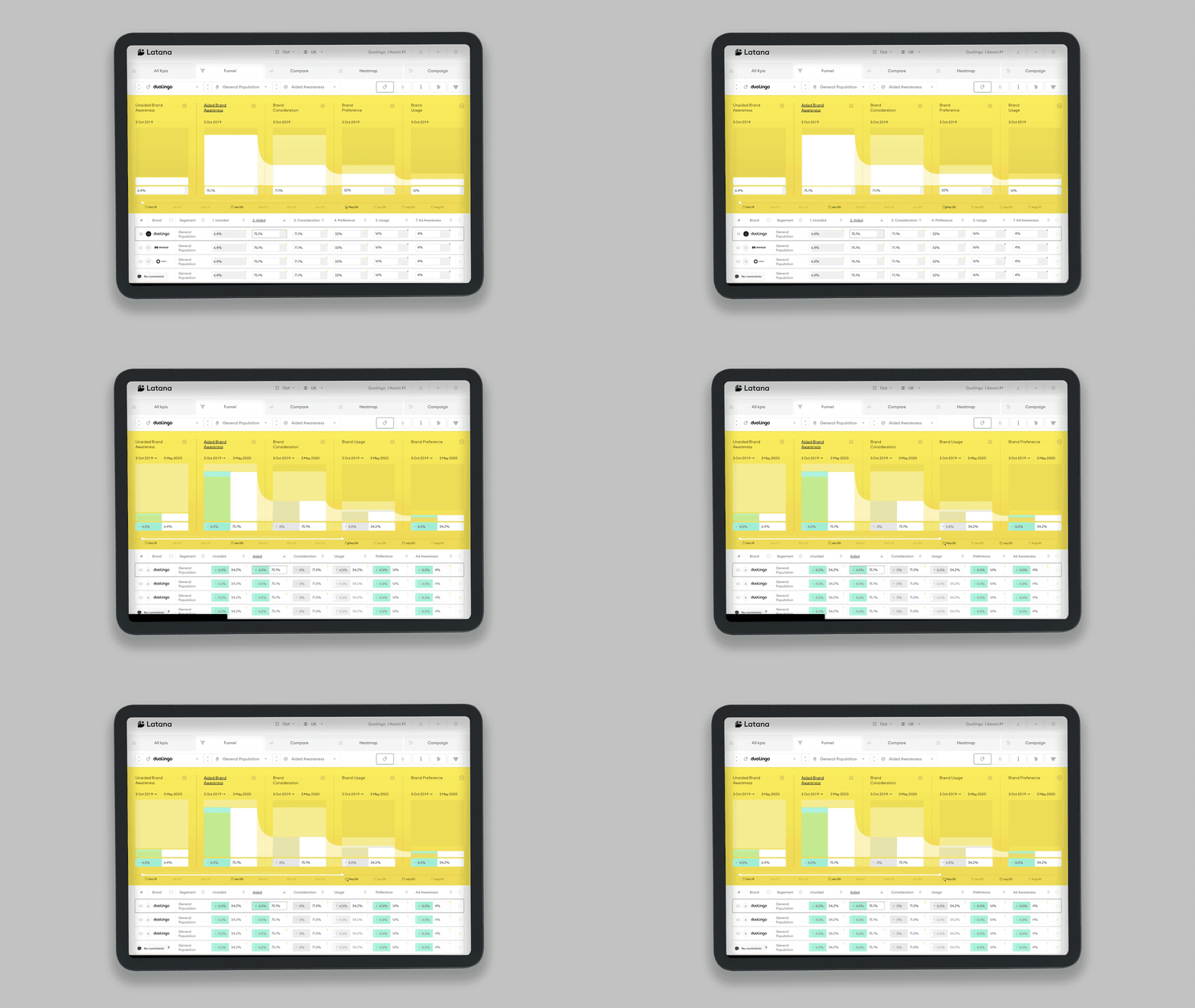
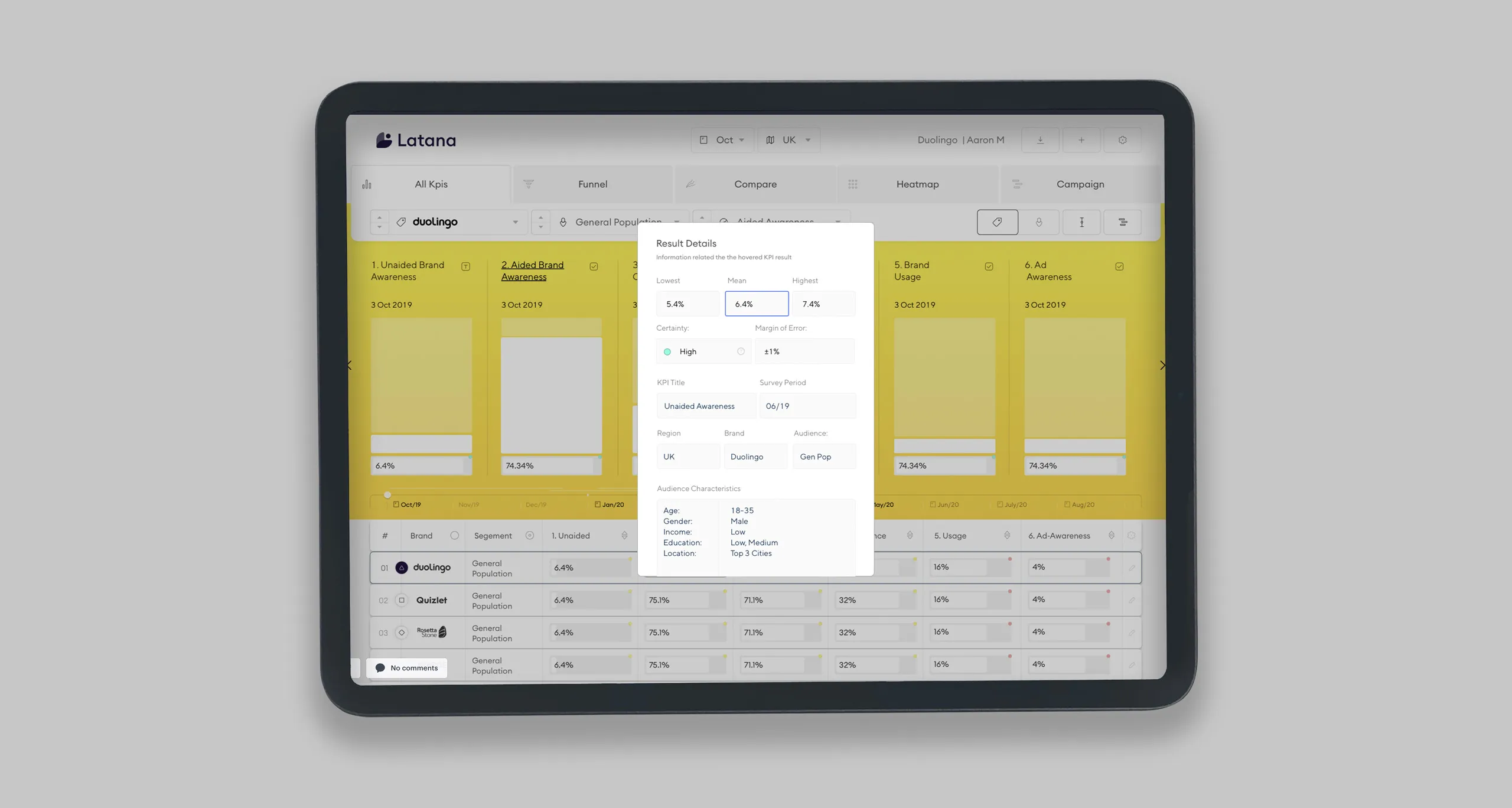
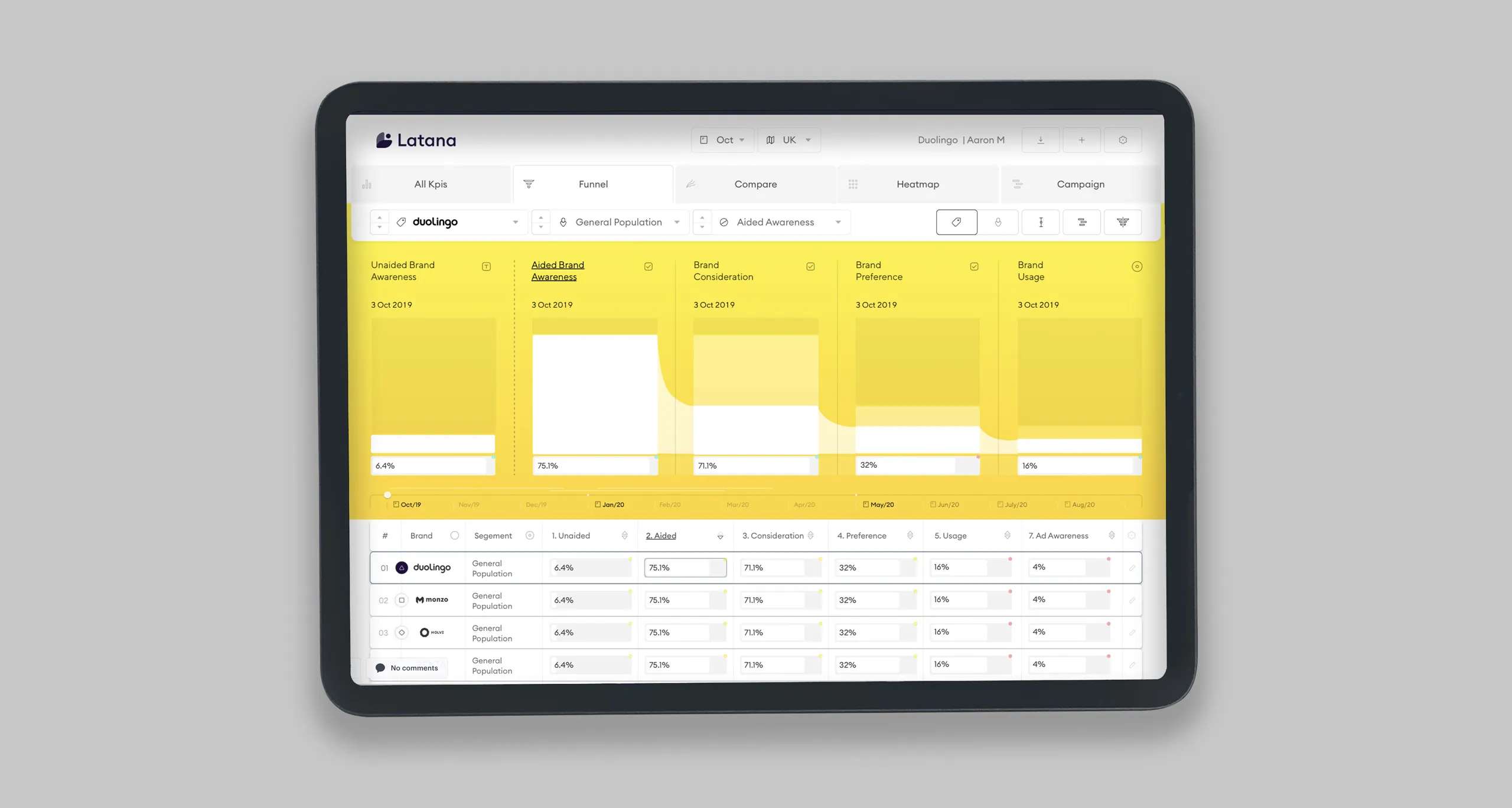
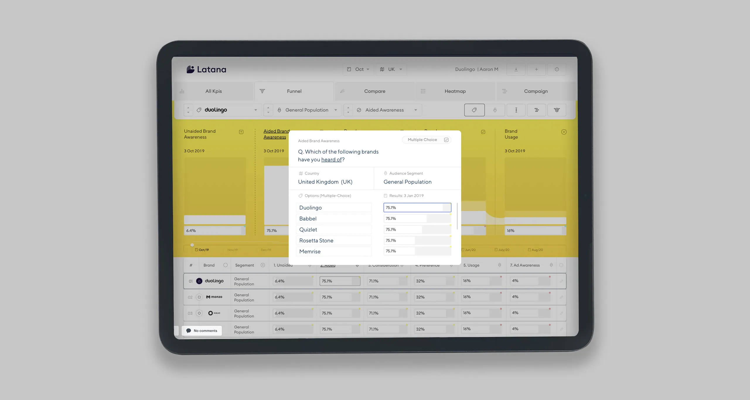
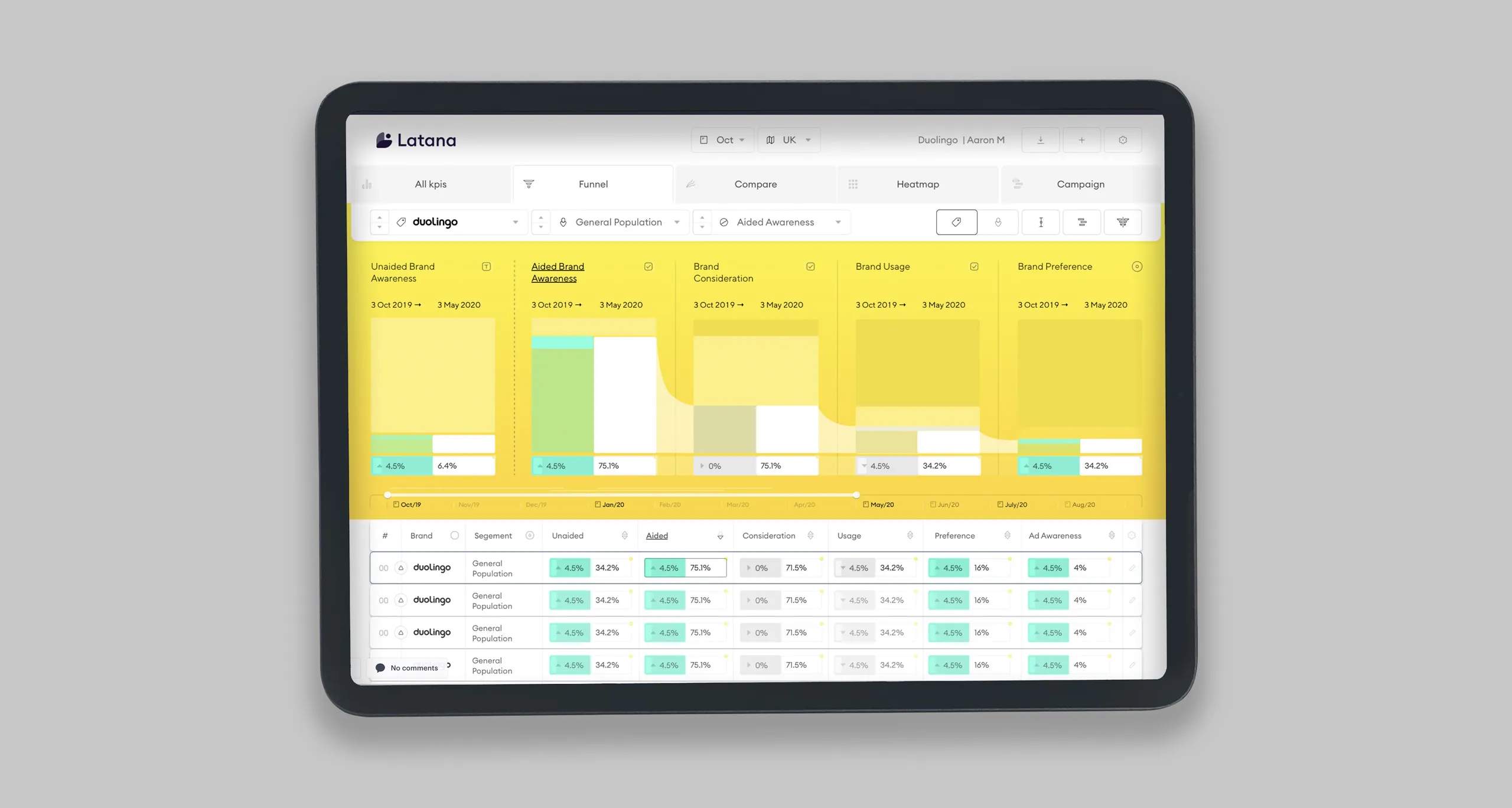
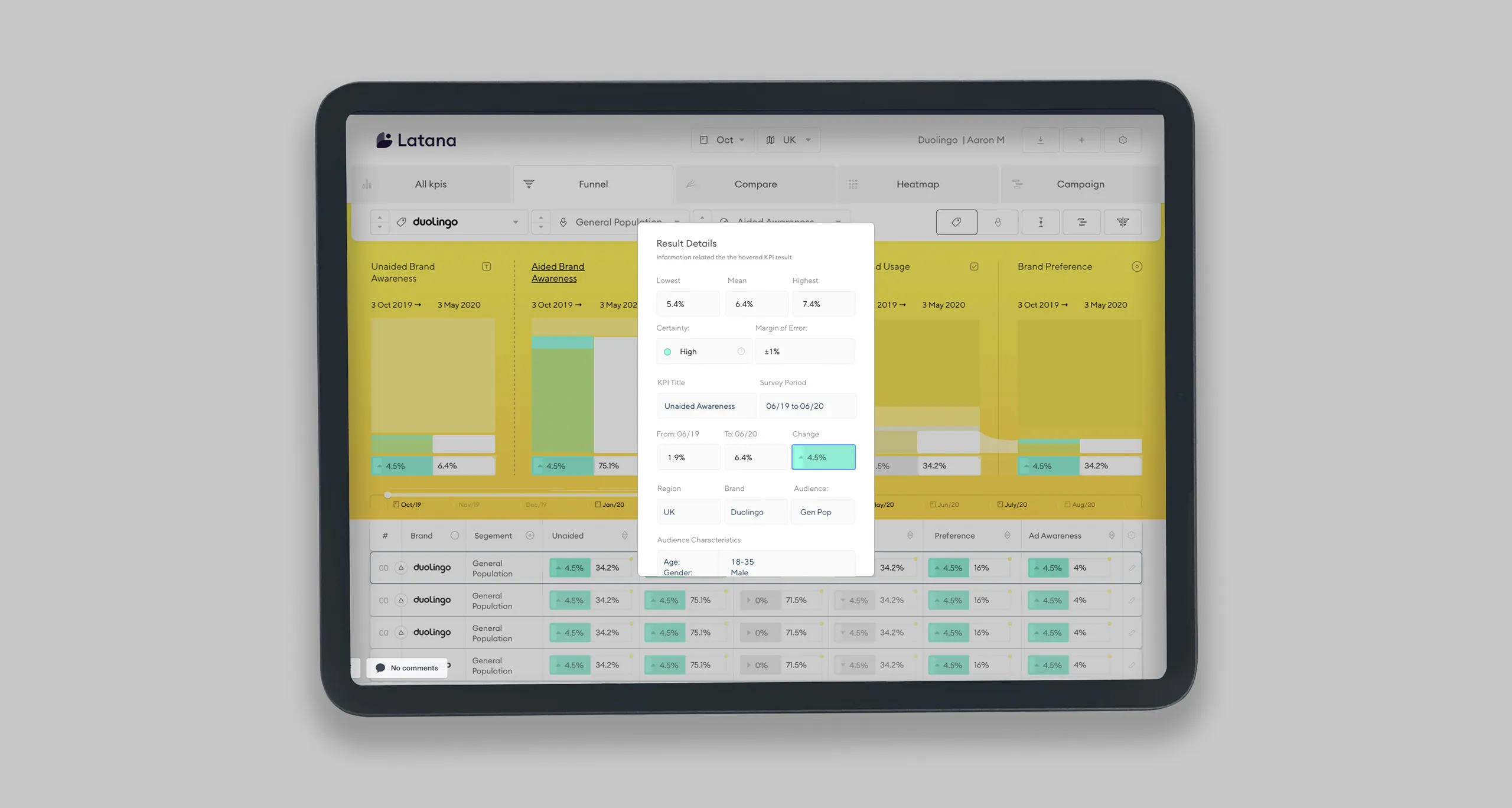
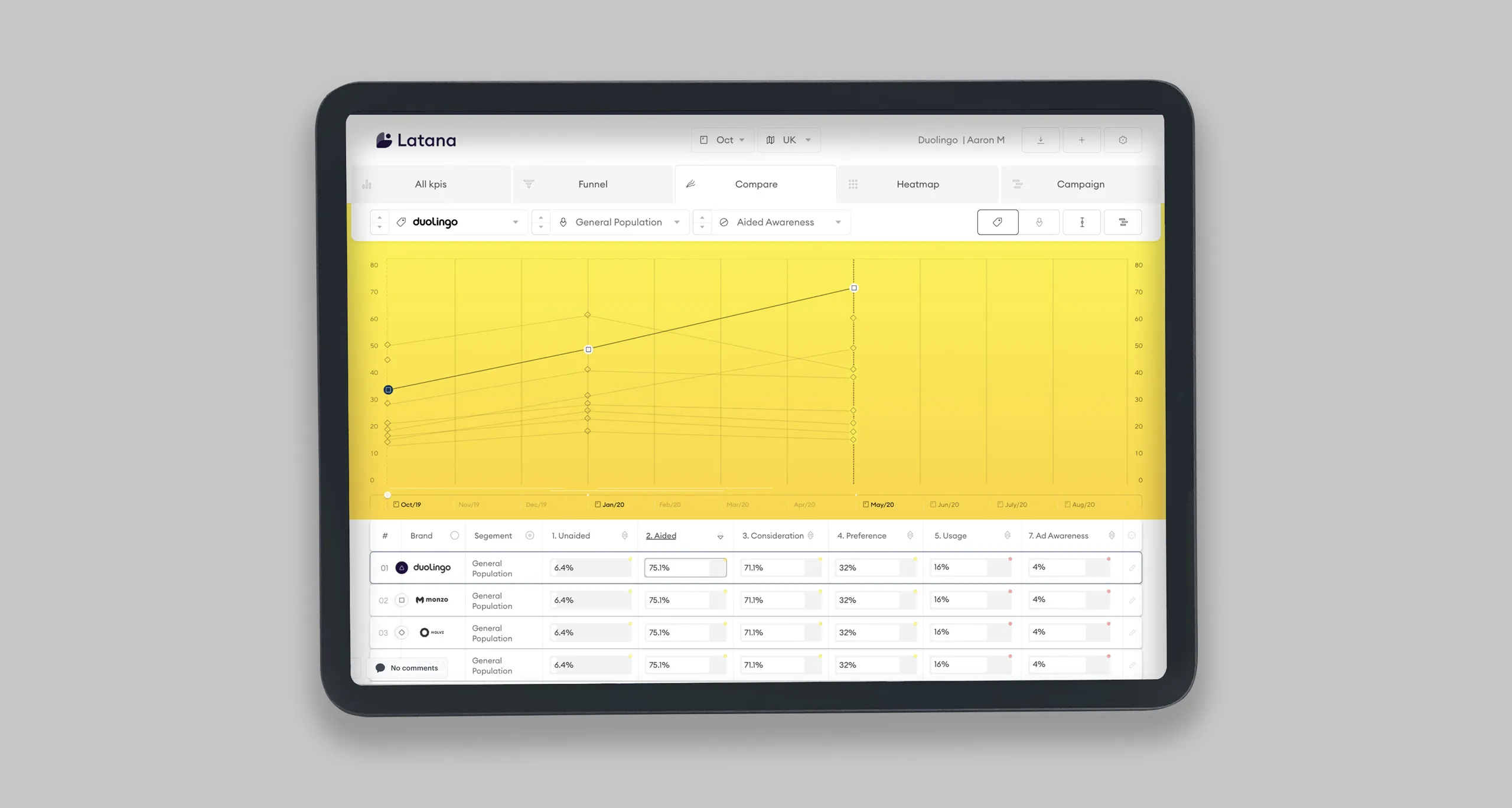
#02 • Latana | B2B Web-Application
"Business that help SMES analyses their own market research about brand perception"
Brief:
I was contracted to design Dalia Research (now Latana) With a MVP (minimal viable product). That being: A service that measures and tracks brand performance over time. Which was tested & Iterated till that value had been provided optimally.
Additionally, to this after the 3-month contract, I continued to take the product from the MVP stage to professional product.
Timeframe:
• 3 Months
Client:
• Dalia Research (now Latana)
Additionally, to this after the 3-month contract, I continued to take the product from the MVP stage to professional product.
Timeframe:
• 3 Months
Client:
• Dalia Research (now Latana)
Role:
• 🔦 User Research (Validate Assumptions)
• 📦 Prototyping
• ✏️ Product Design (UI/UX)
• 🗺 Project Management
• 🤝 Dev Handover
• 🔊 Branding
• 📦 Prototyping
• ✏️ Product Design (UI/UX)
• 🗺 Project Management
• 🤝 Dev Handover
• 🔊 Branding
Process:
Phase 1
Over a period of 3 Months did 2-3 user interviews with brand managers per week, at the same time started developing designs for the prototype to further test and adapt
Phase 2
Prepped the design for implementation into code
Phase 3
After the initial VP product push stayed for a further year to iterate the product into a professional product.
Achievements:
• ⚡️ MVP Built 📦 in 3 months
• ✅ Earning 💸 triple-digit annual recurring revenue(ARR) in the 1st year
• ✅ Earning 💸 triple-digit annual recurring revenue(ARR) in the 1st year
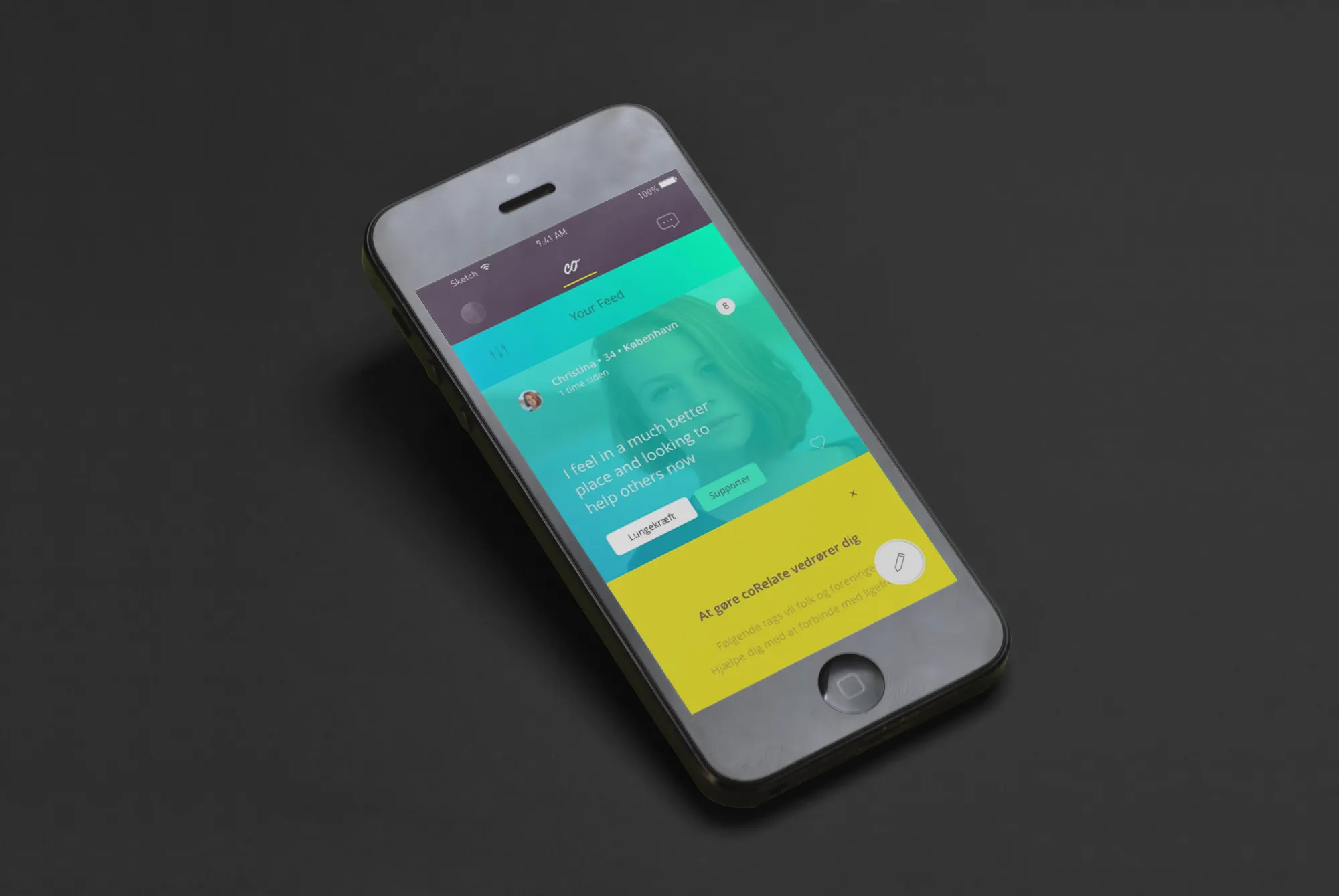
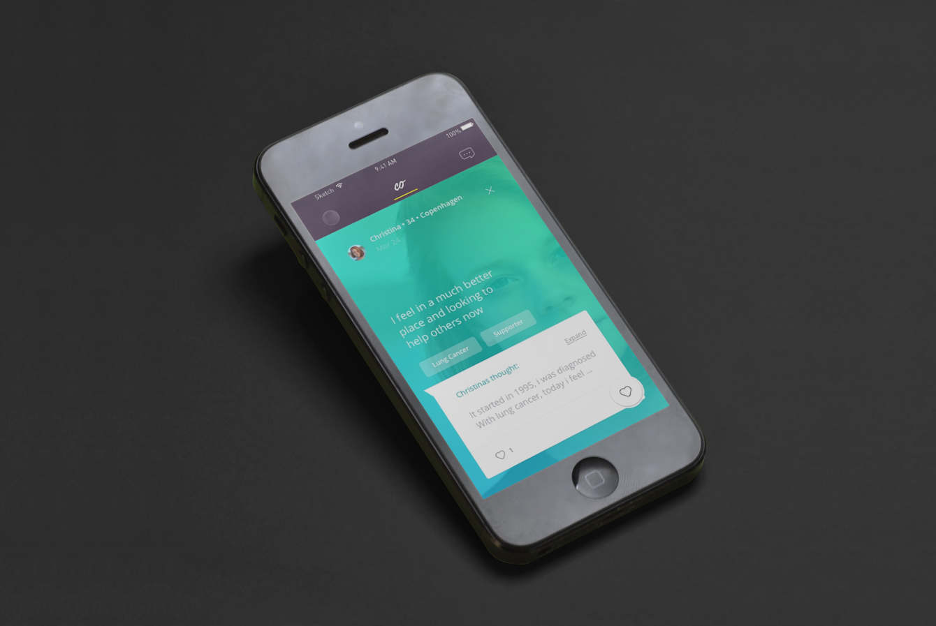
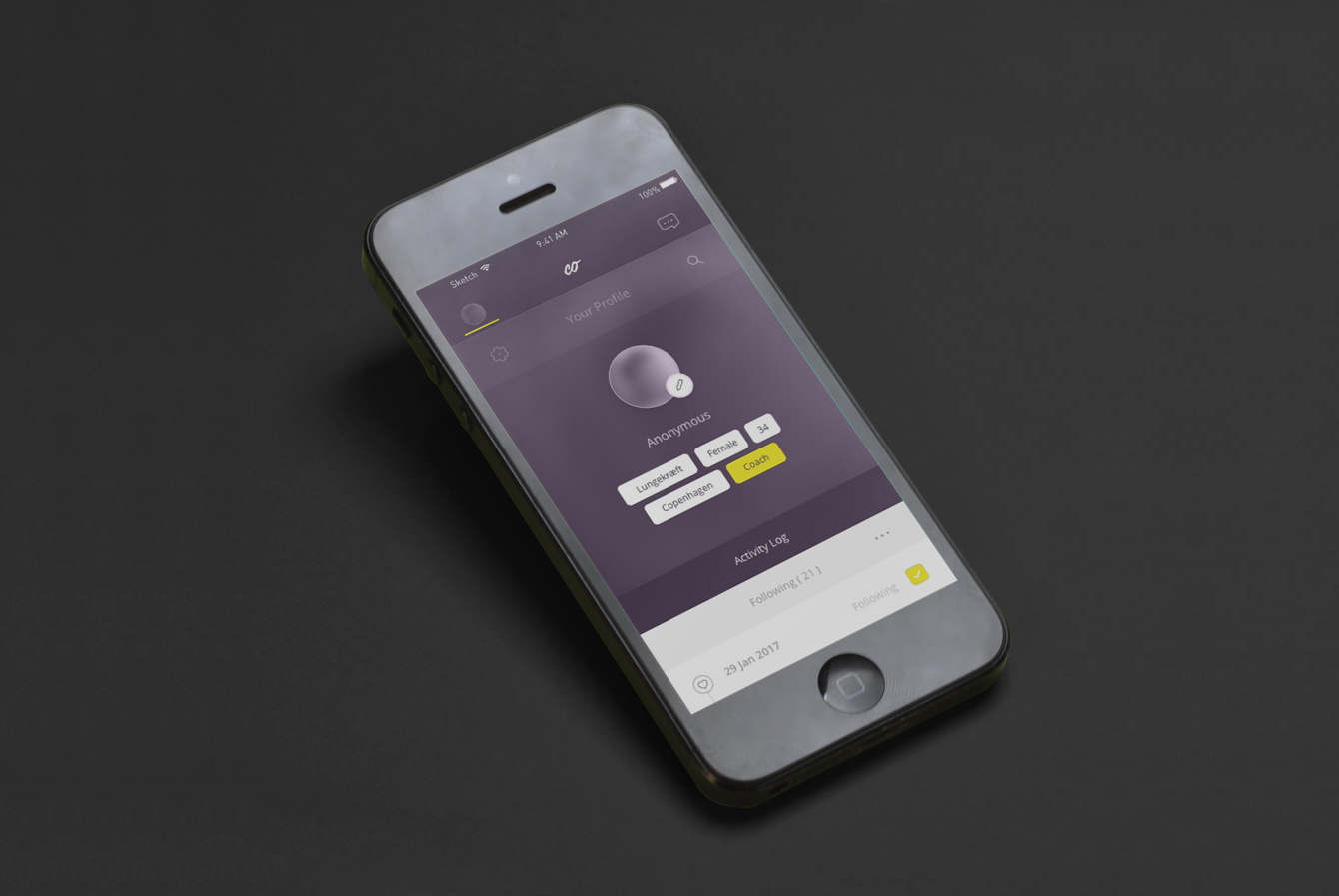
#03 • CoRelate | B2C iOS-Application
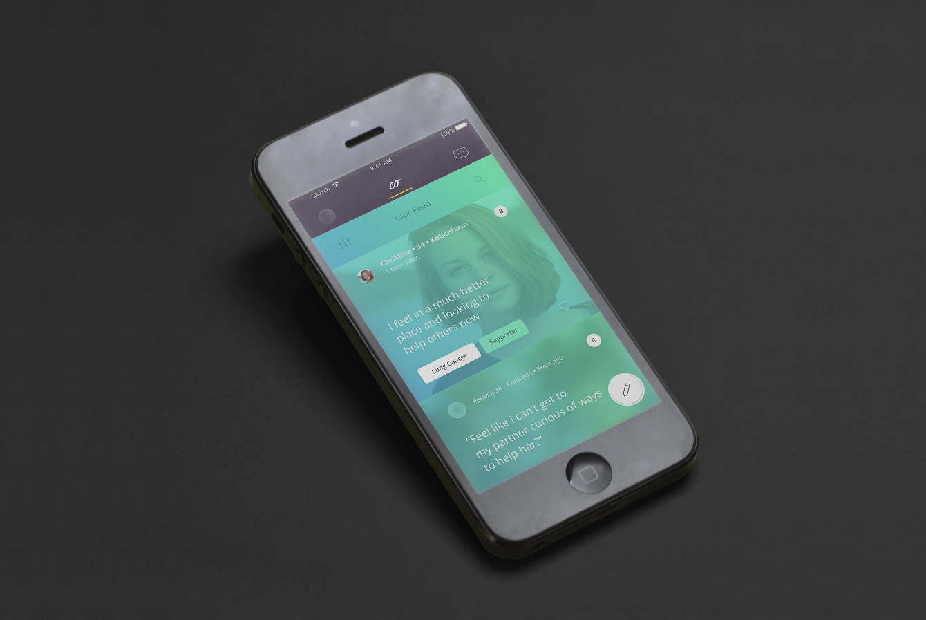
"A safe place for sharing your thoughts around health"
Brief:
I was hired as a consultant for a two-week sprint of user-centered research resulting in a prototype of the desired experience. After of which I suggested that I support the project and startup full-time to see the full implementation of the prototype, and leading the product development.
Product Description
coRelate' A safe place for sharing your thoughts around health' coRelate builds on a dream of creating a platform that enables likeminded to find each other. Regardless of this being rooted in a disease, a concern, or merely a thought - our ambition is to connect individuals in the same situation with the sole purpose of sharing experiences and stories.
Timeframe:
• 2 Weeks > 1 Year
Client:
• CoRelate
Role/s:
• 🔦 User Research (Validate Assumptions)
• 📦 Prototyping
• ✏️ Product Design (UI/UX)
• 🗺 Project Management
• 🤝 Dev Handover
• 🔊 Branding
• 📦 Prototyping
• ✏️ Product Design (UI/UX)
• 🗺 Project Management
• 🤝 Dev Handover
• 🔊 Branding
Process:
1st Phase 1
- User Research interviews
- Co-creation workshops
Phase 2
- System Architecture + Wire-framing
- Prototyping
- Product Development
Phase 3
- Marketing Website & Videos
- User Research interviews
- Co-creation workshops
Phase 2
- System Architecture + Wire-framing
- Prototyping
- Product Development
Phase 3
- Marketing Website & Videos
Achievements:
• 🔬 Crafted & Managed user research workshops and interviews to in/validate the user-need
• ✏️ Designed The full iOs application
• 🗺 Project-Managed The iOs development
• 📺 Featured Product featured on 🇩🇰 Danish TV
• ✏️ Designed The full iOs application
• 🗺 Project-Managed The iOs development
• 📺 Featured Product featured on 🇩🇰 Danish TV
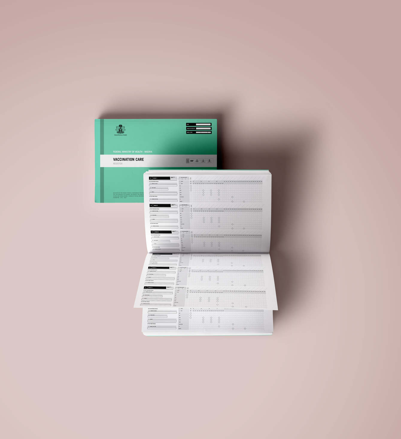
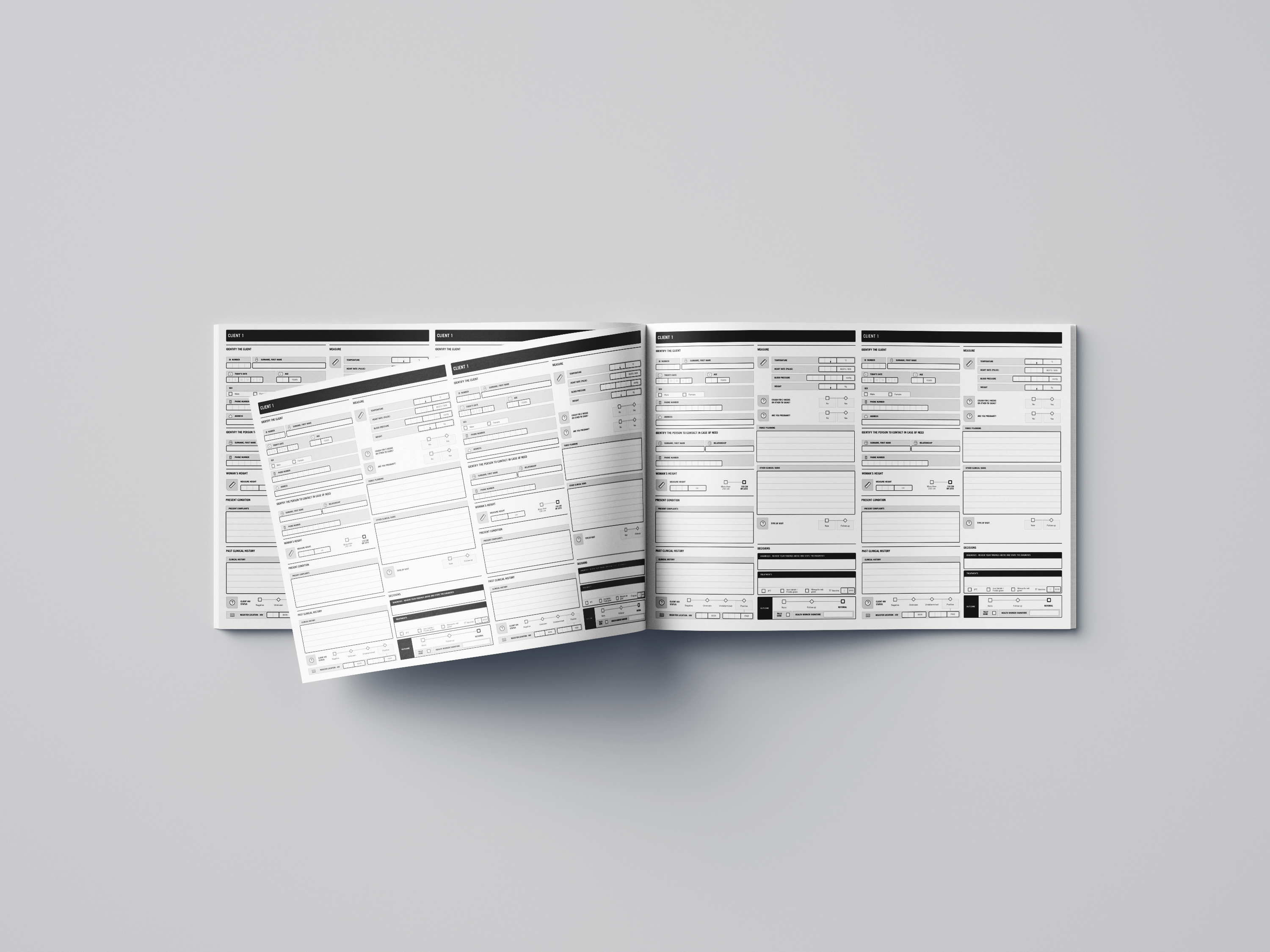
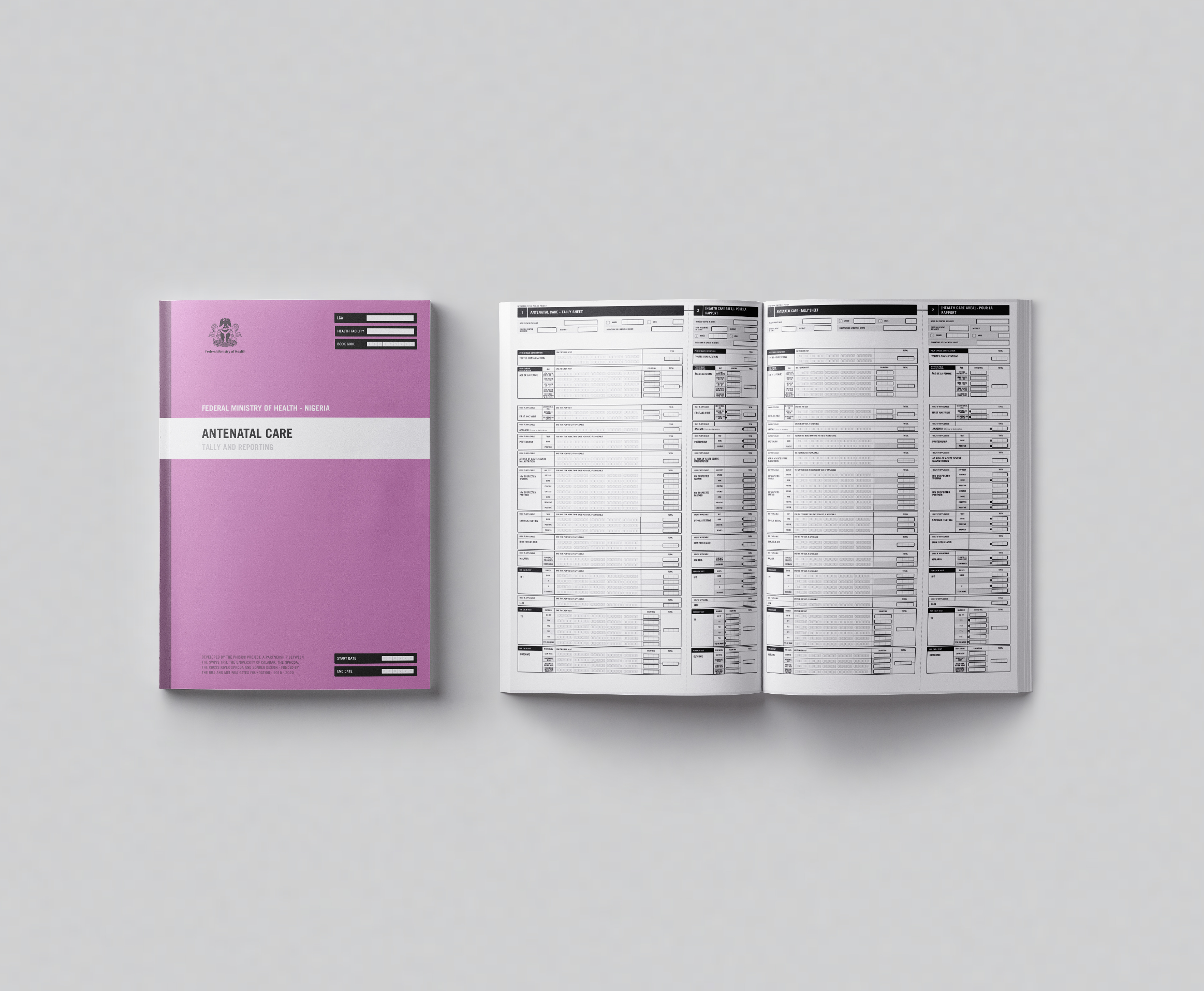
#04 • 📃Phisicc | Paper Based Medical Forms
"Paper based medical forms that assist medical staff in remote communities in 3 African countries in avoiding mistakes during diagnosis"
Brief:
I was contracted for the visual design and development of a set of medical forms for the Phisicc project 16+.
The forms were to be used by remote medical professionals in Côte d'Ivoire, Mozambique, and a third African country to help provide better care to their patients.The project required a deep understanding of both technical and medical concepts, and was highly complex in nature.
We worked closely with the Swiss TPH on accurately representing medical decisions and ensuring that the forms were 100% accurate, easy to use, and tailored to the specific needs of medical professionals in the target countries.
In total, we produced more than 16 medical forms covering a range of topics, including maternal care, vaccines, and general sickness. The forms were well received and have been used to improve the quality of care in the region.
Timeframe:
• 8 Months
Client:
• Swiss TPH, Via Sonder Design Collective
Role/s:
• 🔦 User Research (Validate Assumptions)
• 📦 Prototyping
• ✏️ Product Design (Graphic)
• 🔦 User Testing
• 📦 Prototyping
• ✏️ Product Design (Graphic)
• 🔦 User Testing
Process:
• Phase 1:
We scoped out the requirements. Understanding the full clinical advice for all medical issues and figuring out how to approach algorithmic decision-making and how to narrow the scope to the simplest principles.
• Phase 2:
Design we cover 12 forms and we create a basic system to convey complex inform with symbols while also just improving the basic form designs
• Phase 3:
User testing: We flew to Cote d'Ivoire to test with medical staff, who each day adapted the design.
• Phase 4:
Final phase was undergoing clinical trials
Achievements:
• ✏️ Designed a unique visual system to convey information without language, and only symbols.
• 🔬 User Tested: Flew to 🇨🇮 Cote d’Ivoire to test the forms with rural medical staff.
• ✅ Validated: the designs went through clinical trials, Averaging +15% across-the-board improvement in life-risking decisions making.
• 🔬 User Tested: Flew to 🇨🇮 Cote d’Ivoire to test the forms with rural medical staff.
• ✅ Validated: the designs went through clinical trials, Averaging +15% across-the-board improvement in life-risking decisions making.
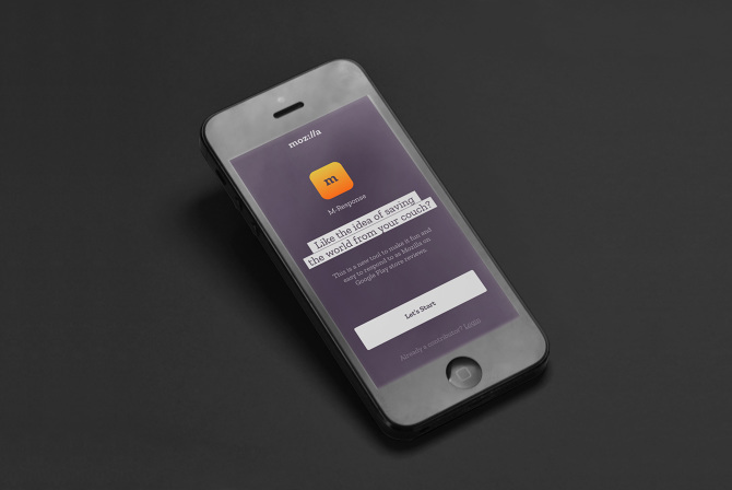
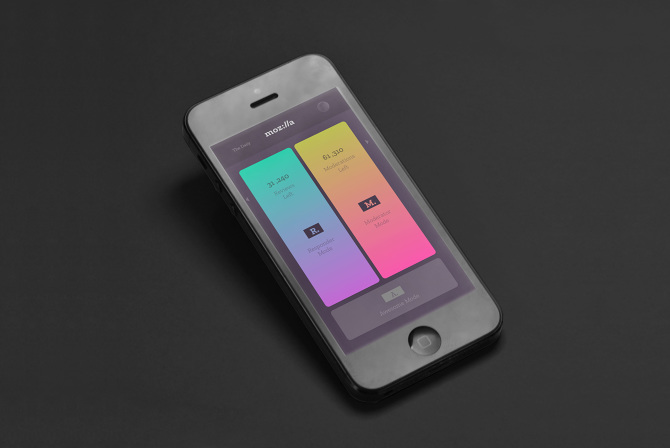
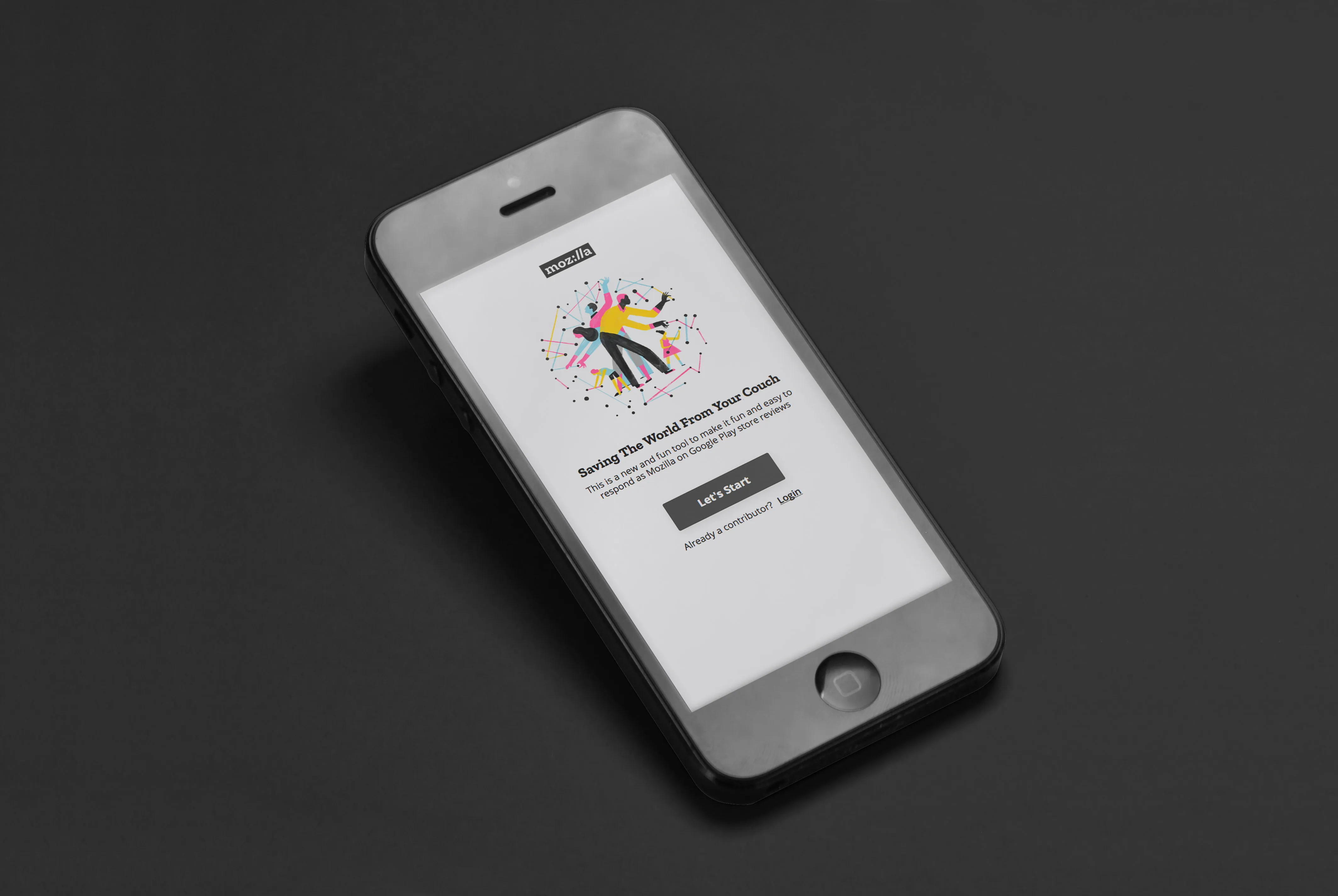
#05 • Mozilla | Crowd Sourced Review
"An mobile first web application to help Mozilla crowd source responses for their product reviews, for Firefox and others"
Brief:
I was contracted by CIID to help Mozilla develop an experiment that aimed to incentivise everyday people to help crowdsource product reviews on the Google Play Store for Mozilla products.
My role in the project was to design and implement strategies to engage and motivate the crowd to participate in the review process. This included creating engaging and informative materials, such as instructional videos and interactive guides, as well as developing a rewards program to encourage participation.
Timeframe:
• One Week
Client:
• Mozilla Foundation
Role/s:
• 📦 Prototyping
• ✏️ Product Design (UI/UX)
• 📣 Presentation
• ✏️ Product Design (UI/UX)
• 📣 Presentation
Process:
• Single Phase:
Had one week to come up with a design for crowd sourced review. The final result was a successful crowdsourcing campaign that generated a large volume of valuable product reviews and helped to improve the overall user experience on the Google Play Store.
Had one week to come up with a design for crowd sourced review. The final result was a successful crowdsourcing campaign that generated a large volume of valuable product reviews and helped to improve the overall user experience on the Google Play Store.
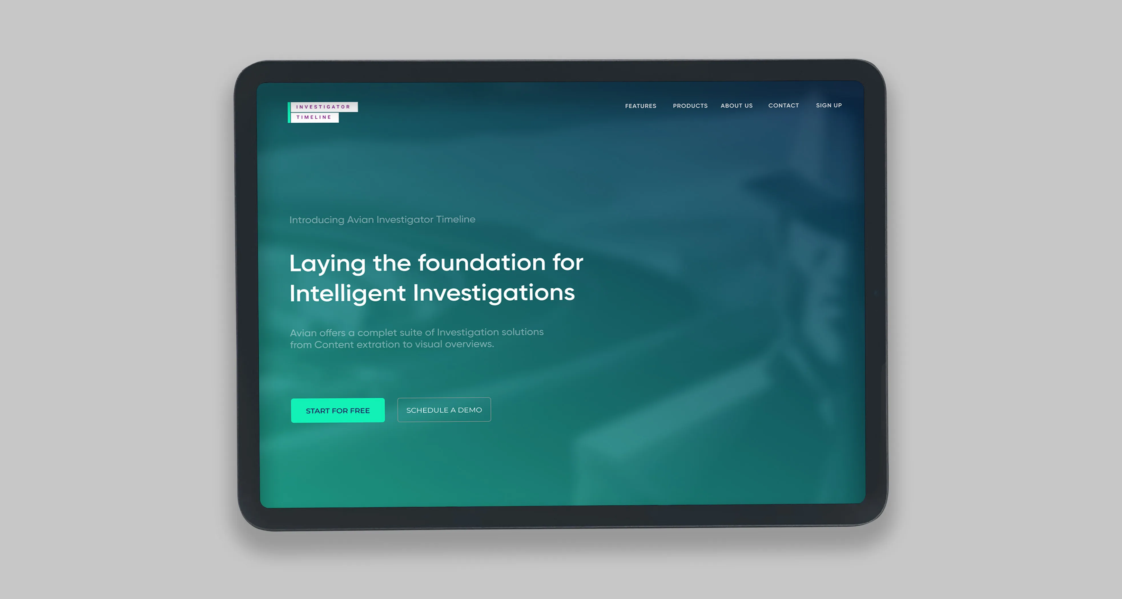
#06 • Investigator Timeline | B2B Web-Application
"A web app which helps companies analyses market research about brand perception"
Brief:
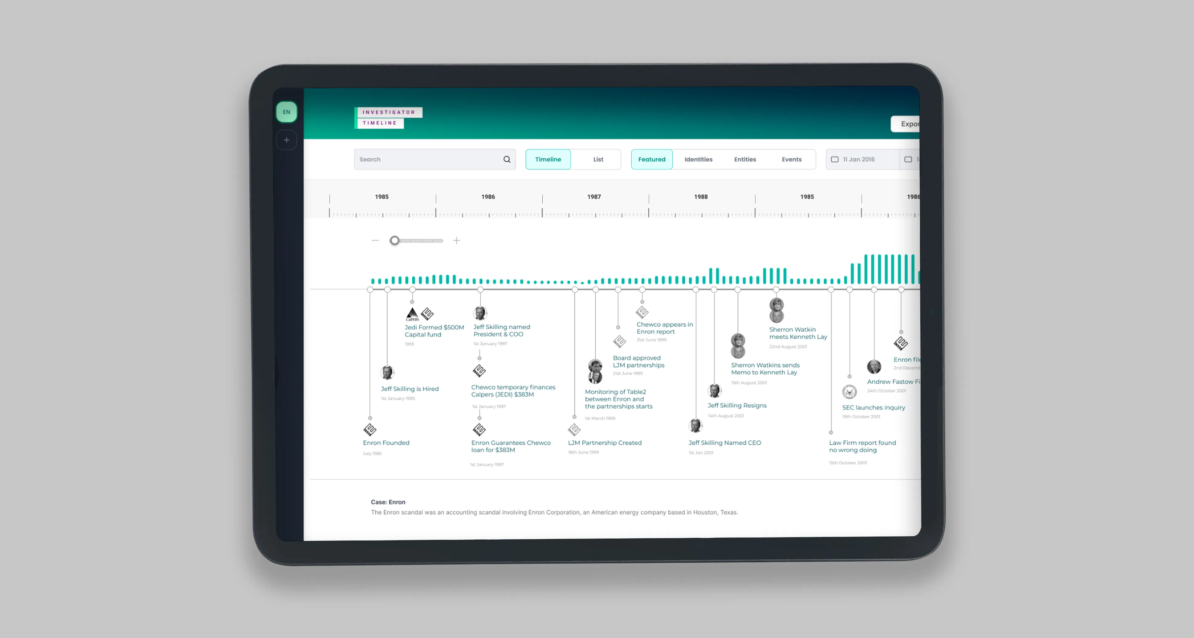
For this project, the brief was to create an investigative dashboard for police officers in Denmark. The purpose of the dashboard was to provide officers with a centralized location for accessing all of the information and resources they need to do their jobs effectively.I designed the dashboard with the specific needs and requirements of police officers in mind.
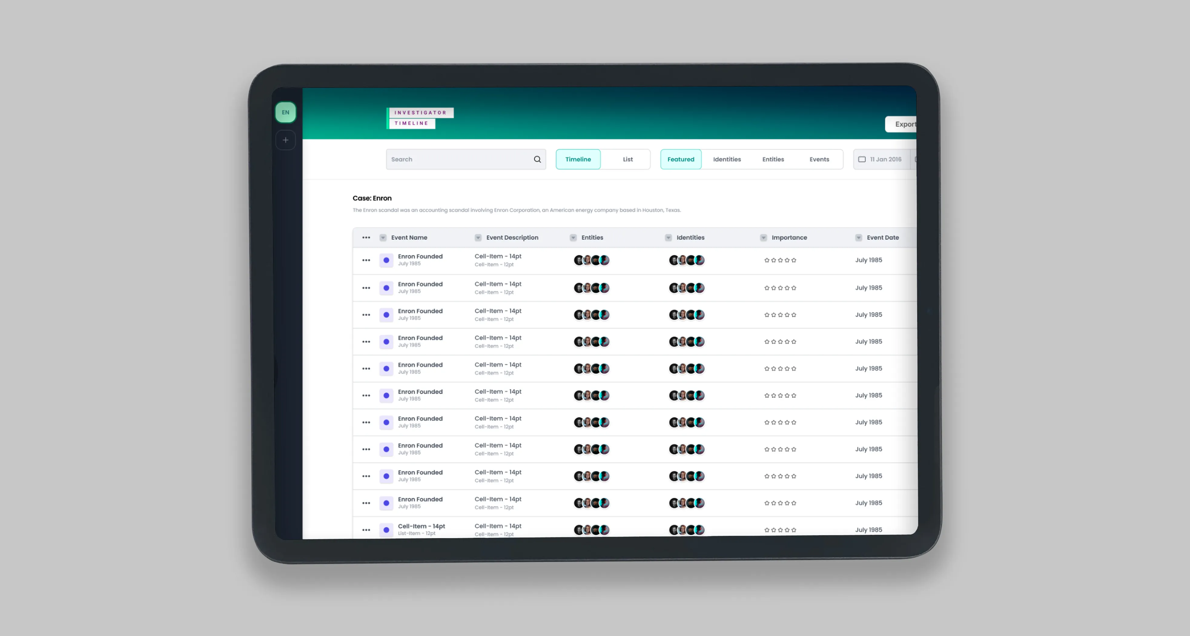
The result was a dashboard that provides officers with quick and easy access to all of the information they need to solve cases and keep communities safe.The dashboard includes a range of features and functionality, including case files, witness statements, suspect information, and more.
It is also fully integrated with other tools and resources that police officers use in their work, making it easy for them to access all of the information they need in one place.Investigative timeline:A timeline is a way to visually represent the events of a case or investigation.
It can be used to help organise information, identify patterns or discrepancies, and understand the sequence of events. A timeline can be created using a variety of tools, including spreadsheet software, graphic design programs, or even a simple pen and paper. Some common elements that may be included on an investigator's timeline include:
• Dates and times of events
• Locations of events
• Names of individuals involved
• Details of any conversations or interactions
• Observations or notes made by the investigator
• Relevant documents or other evidence
Timelines can be especially useful in cases where there are multiple witnesses or suspects, or when there is a large amount of evidence to review. They can help investigators stay organised and ensure that they don't overlook any important details.
Timeframe:
Role/s:
• 🔦 User Research (Validate Assumptions)
• 📦 Prototyping
• ✏️ Product Design (UI/UX)
• 🗺 Project Management
• 🤝 Dev Handover
• 🔊 Branding
• 📦 Prototyping
• ✏️ Product Design (UI/UX)
• 🗺 Project Management
• 🤝 Dev Handover
• 🔊 Branding
Process:
• Phase 1:
Initial this brief was a quick high fidelity mock up that was intended to get financing for the actual product.
• Phase 2:
After financing i helped to further develop the product, in the form of design handover
Initial this brief was a quick high fidelity mock up that was intended to get financing for the actual product.
• Phase 2:
After financing i helped to further develop the product, in the form of design handover
Achievements:
• ⚡️Rapid process two week brief to delivered high fidelity prototype.
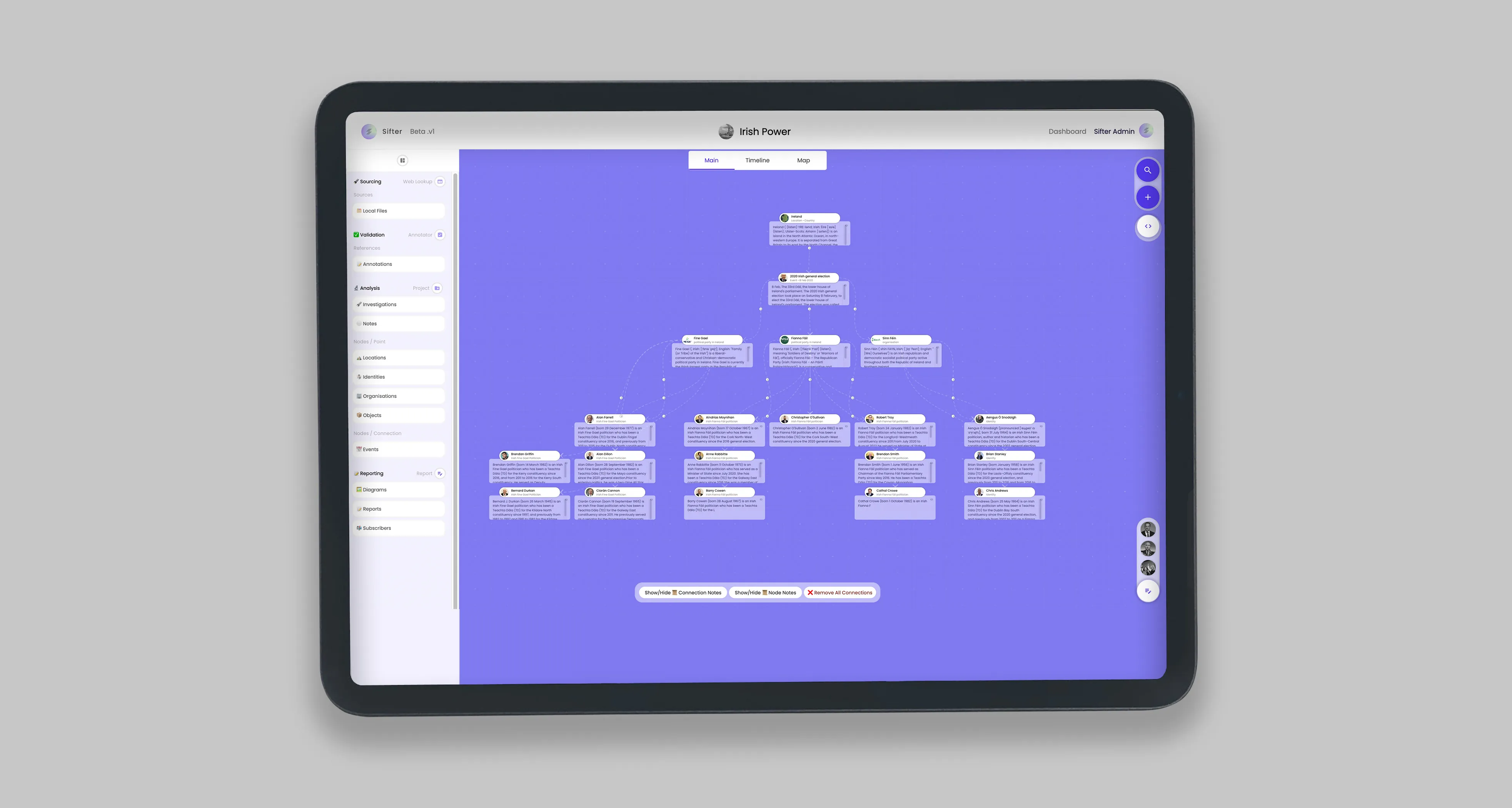
2023 | ⚡️ Sifter • OSINT Investigation Tool
"Open-source intelligence tool (OSINT) that empowers any investigator to collect, analyse and report their findings visually."
Brief:
Designed and built from the ground up, this impact focused organisation, which is mission is to help investigative journalist and researchers more broadly with their daily workflow. and give them new access to income streams from their raw research.
Solution:
Sifter, is an open-source intelligence tool (OSINT) that empowers any investigator to collect, analyse and report their findings visually.
Problem:
Investigations are hard and time-consuming, which makes them very costly. Especially open-source investigations, which by their nature require coding skill sets
Value Proposition:
We radically reduced the time of investigations, by uncovering hidden patterns sooner. Whilst also providing a new crowdsourced income stream
What is it?
We give investigators a simple way to collect and search through sources, and then we have an amazing user experience for analysing their findings
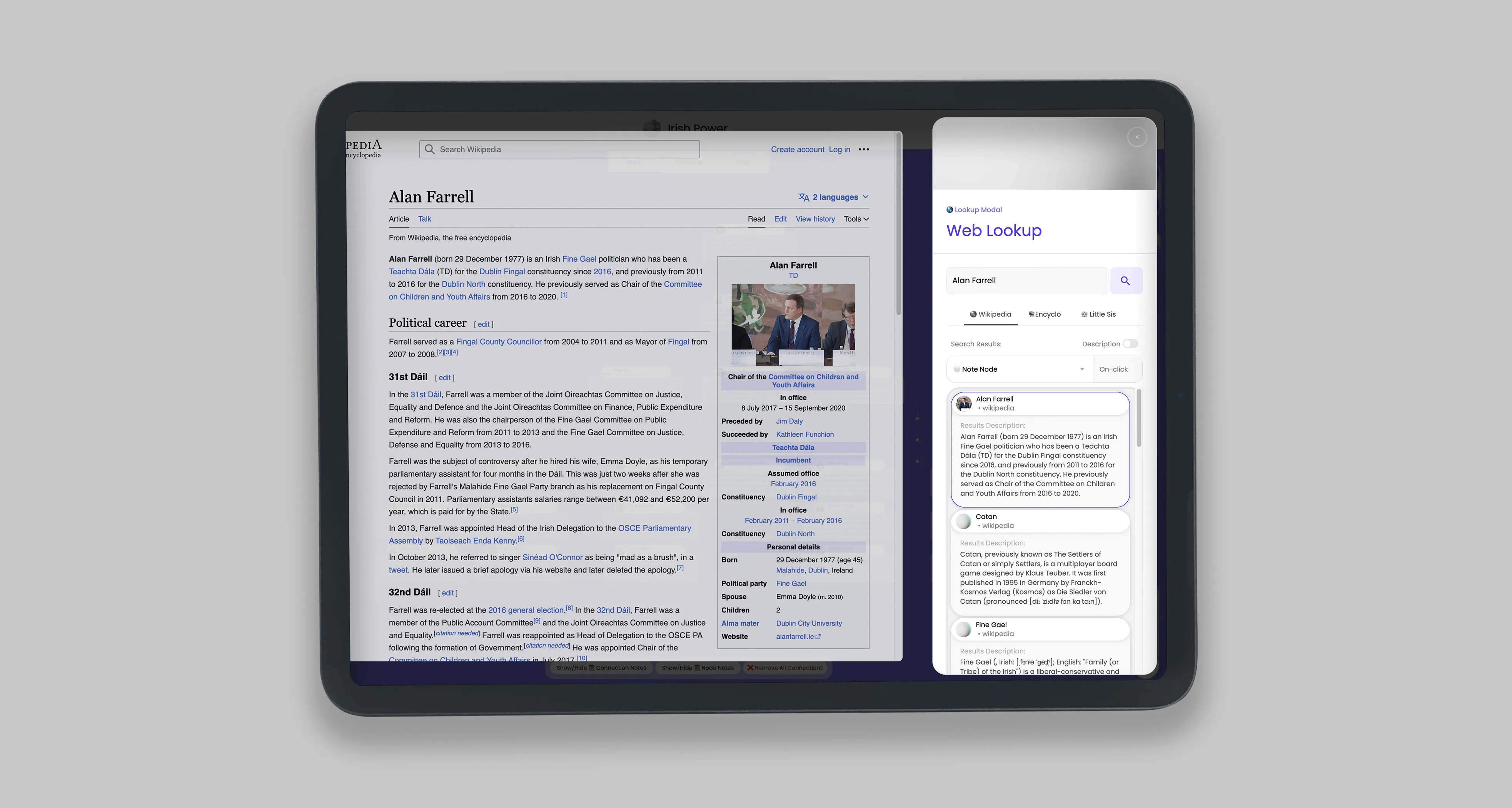
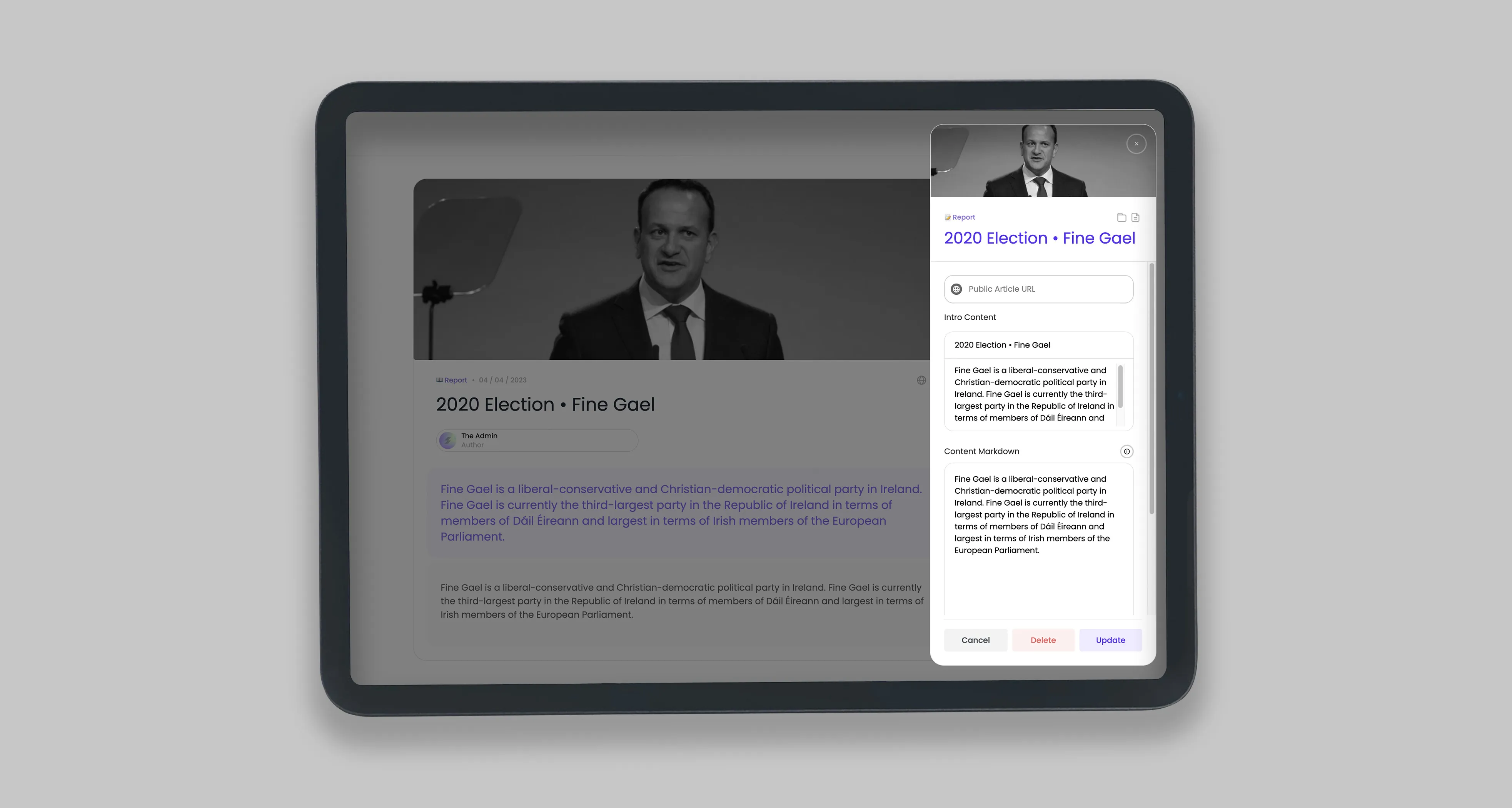
We have built a SAAS product that combines private and publicly sourced data sets, with user-generated notes. which is complemented with a browser extension to directly reference inline statements. All data points are visually collated in a user-friendly node-based graph, from which reports are crafted, and subscribed to by internal or external audiences.
Key Users:
Typical users are investigators, initially investigative journalists, then broadening out to researchers, and business analysts.
Business Model
User Investigators subscriptions
Business Type
Impact-focused, for-profit (assisting independent investigative journalists) funds reinvested towards impact.
Role/s:
• ✏️ Product Design (UI/UX)
• 👾 Product Development (Low-Code)
• 🔊 Branding & Marketing
• 🆎 Written Content
• 📽 Video Content
• 💼 Business Design/Model
• 👾 Product Development (Low-Code)
• 🔊 Branding & Marketing
• 🆎 Written Content
• 📽 Video Content
• 💼 Business Design/Model
Process:
• Phase 1
User research interviews
• Phase 2
product design and development
alpha > beta launch
• Phase 3
Product market fit
User research interviews
• Phase 2
product design and development
alpha > beta launch
• Phase 3
Product market fit
Achievements:
• 👨💻 Coded the platform myself
• 🤝 Partnered With Ex-Wikipedia Larry Sanger with Encyclosphere API
• 🔗 Integrated 🌍 Wikipedia, 👧 Little Sis, and 💬 OpenAI
• 🤝 Partnered With Ex-Wikipedia Larry Sanger with Encyclosphere API
• 🔗 Integrated 🌍 Wikipedia, 👧 Little Sis, and 💬 OpenAI
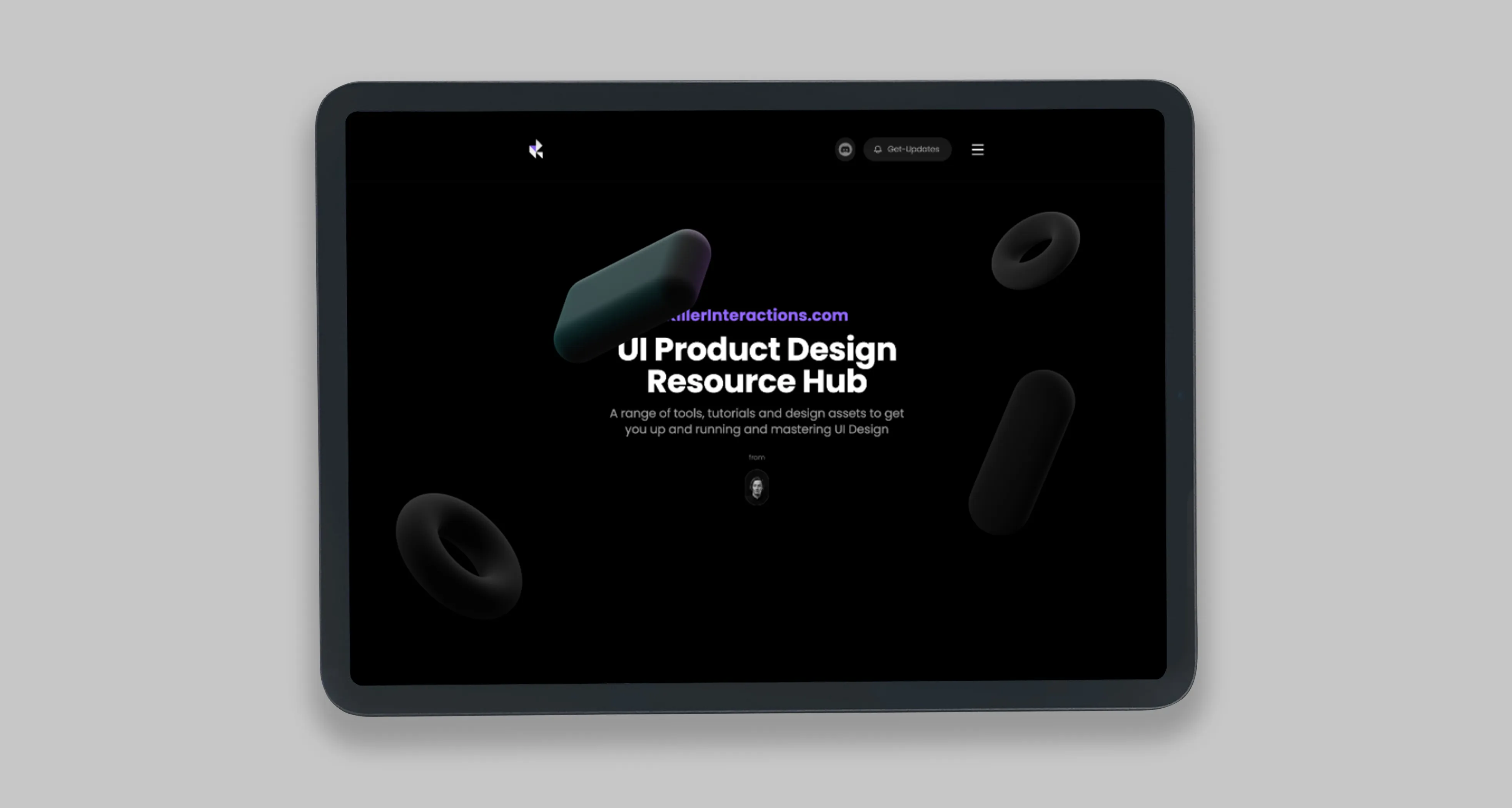
2021 | 🔪 Killer Interactions
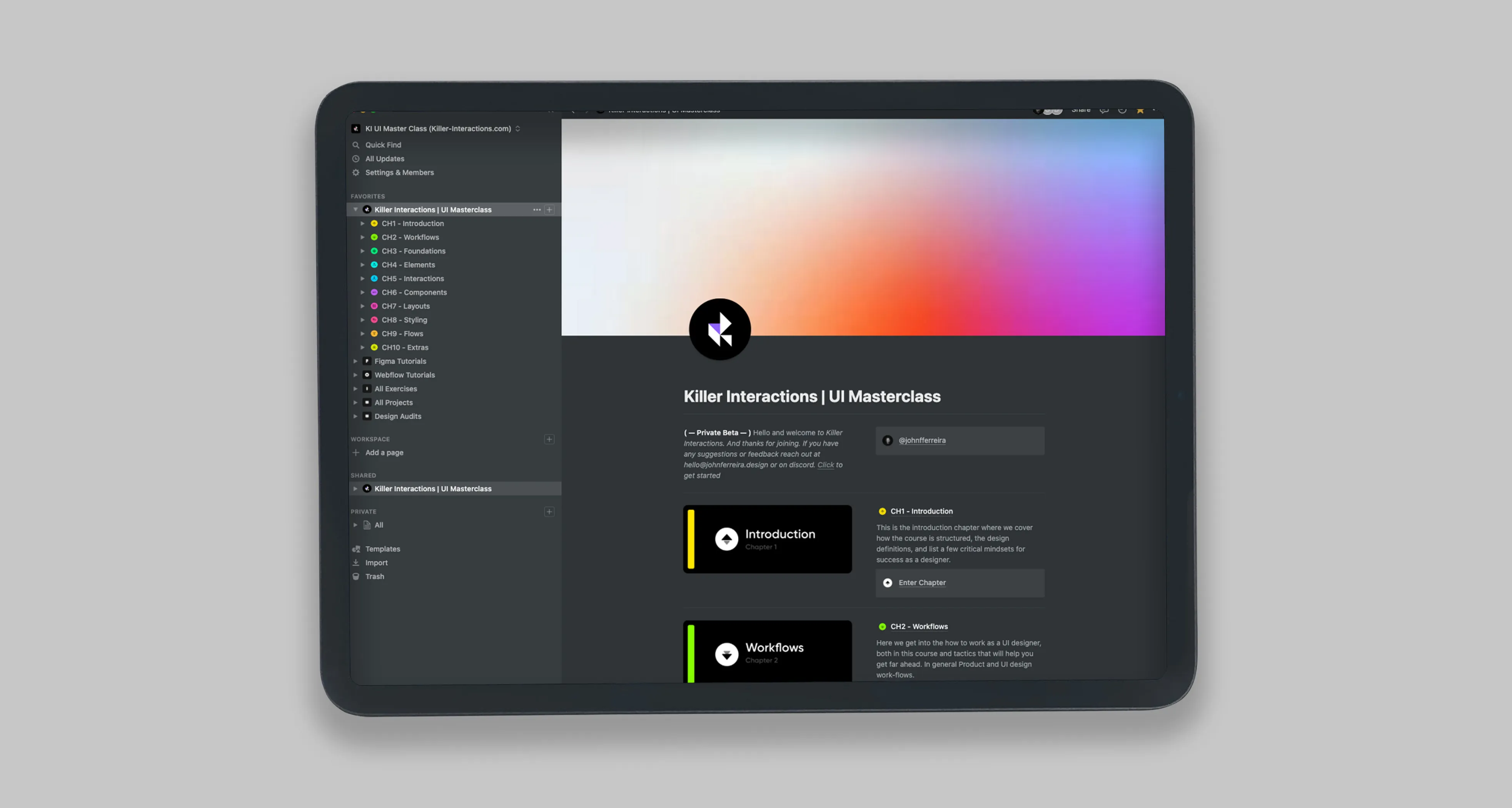
User Interface Design Resource Hub. Including a fully guided, exercise driven approach to learning UI design and crafting design systems.
Brief:
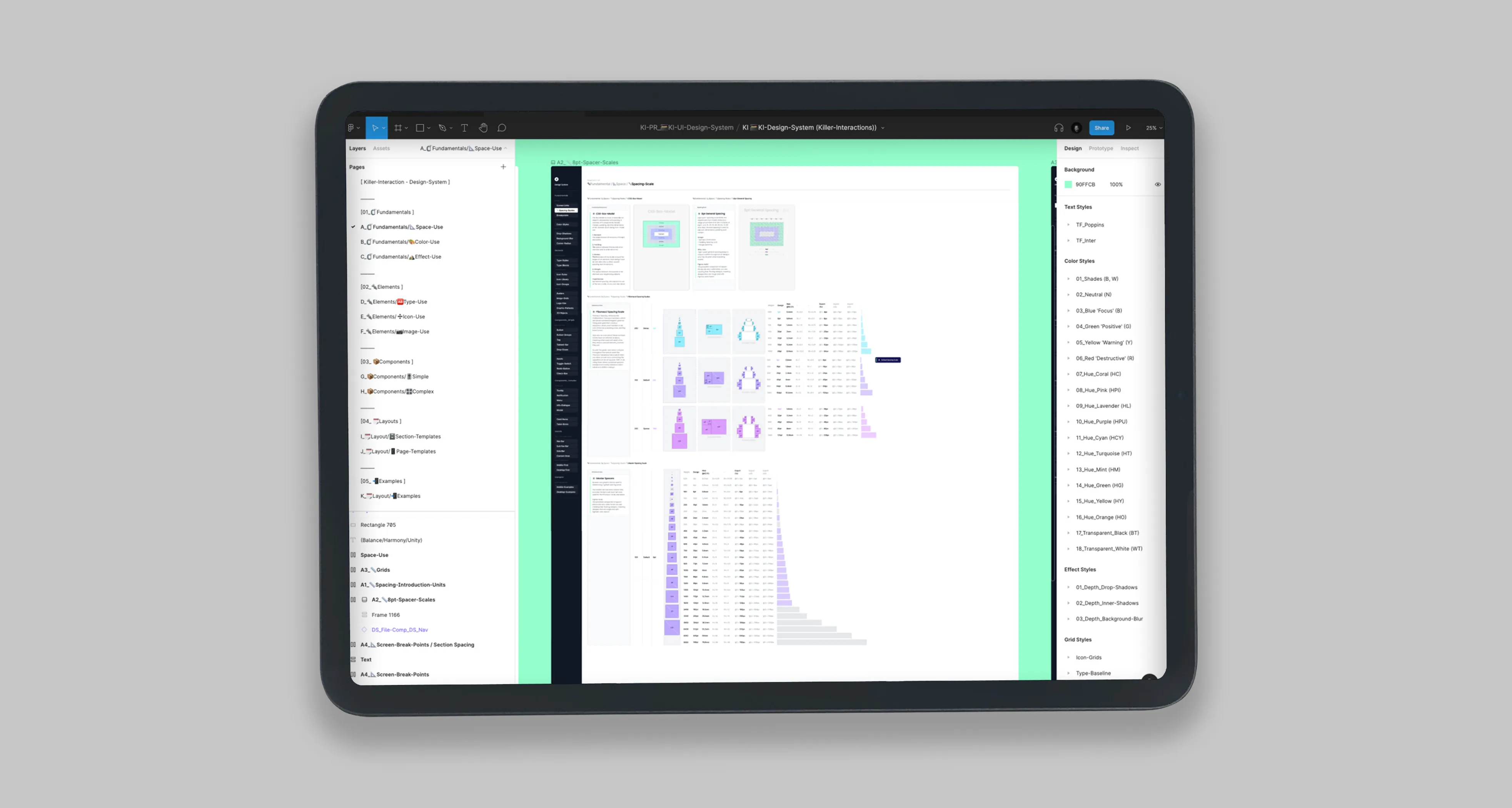
Building an education resource hub for user interface design which is intended to help an absolute beginner in design understand everything from the very basics of designing for software all the way through to advanced concepts for tenured designers, that will speed workflows and assist in building better products.Current products:- UI Master Class (Video Series)- Design System (Figma Library File), and- Icon Sets (Product/Marketing)
Product:
UI Masterclass (Video Course):KI UI Masterclass is a video tutorial series and a digital wiki of every visual design skill needed for user interface design. It is great for those that don't have a design background. Perfect for those who want to further themselves within screen based design.
Role/s:
• 🆎 Written Content
• 📽 Video Content
• ✏️ Product Design (UI/UX)
• 🔊 Branding & Marketing
• 💼 Business Model
• 📽 Video Content
• ✏️ Product Design (UI/UX)
• 🔊 Branding & Marketing
• 💼 Business Model
Process:
Phase 1
Spent a large amount of time collecting all i could find on UI design, and understanding what was the best thinking out there.
Phase 2
Create a liner approach to learning all of it, as a beginner then as tested a professional.
Phase 3
Placed all the content into a notion wiki, and developed the written and video content.
Achievements:
• ✏️ Created all 🎓 Educational-content
• ✏️ Created brand & 🔊 Marking-material
• ✏️ Created my own 🧰 Design-System
• ✏️ Created brand & 🔊 Marking-material
• ✏️ Created my own 🧰 Design-System
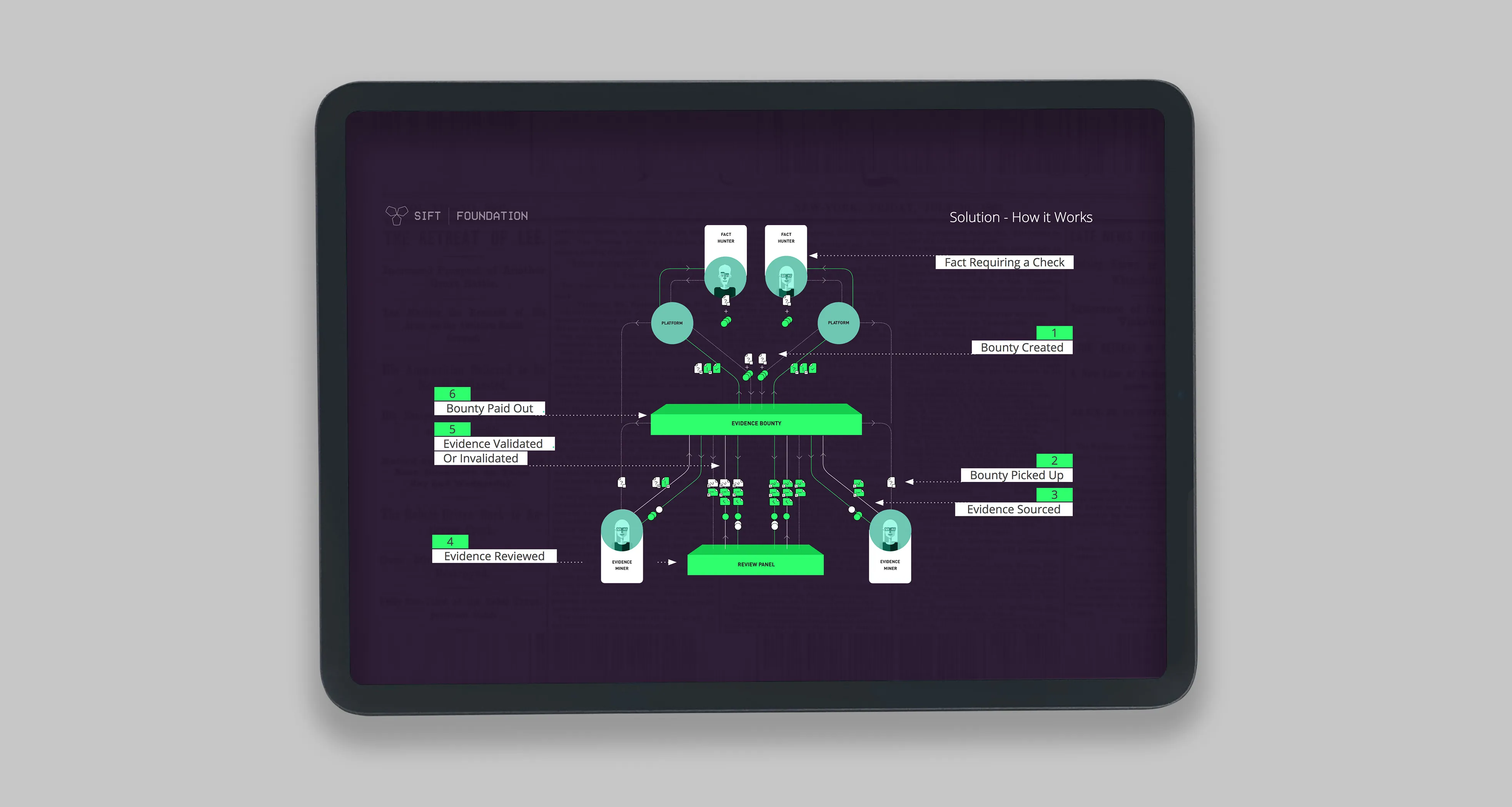
2017 | 🔗 Blockchain Protocol | Crowdsourced • Fact Checking
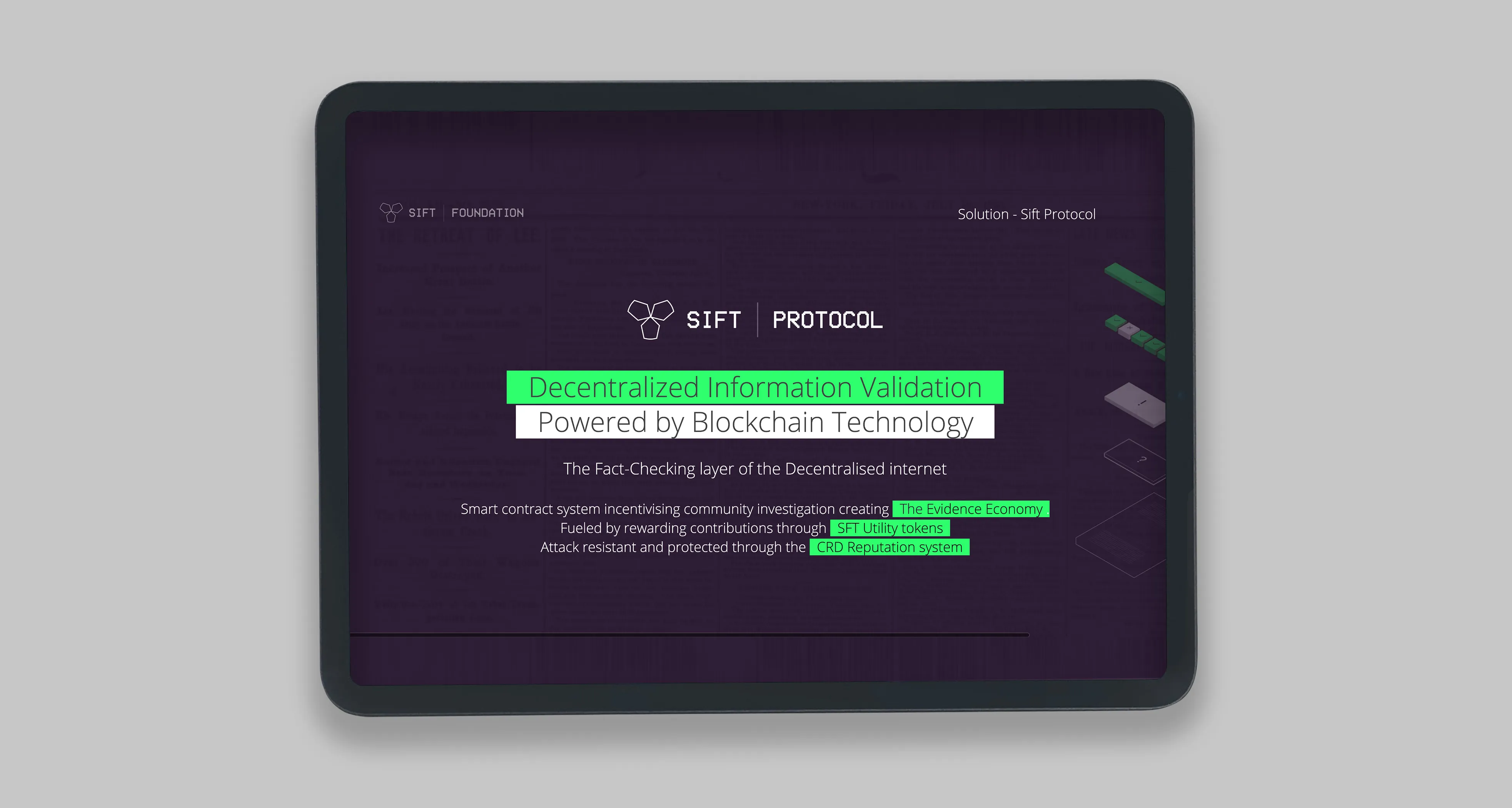
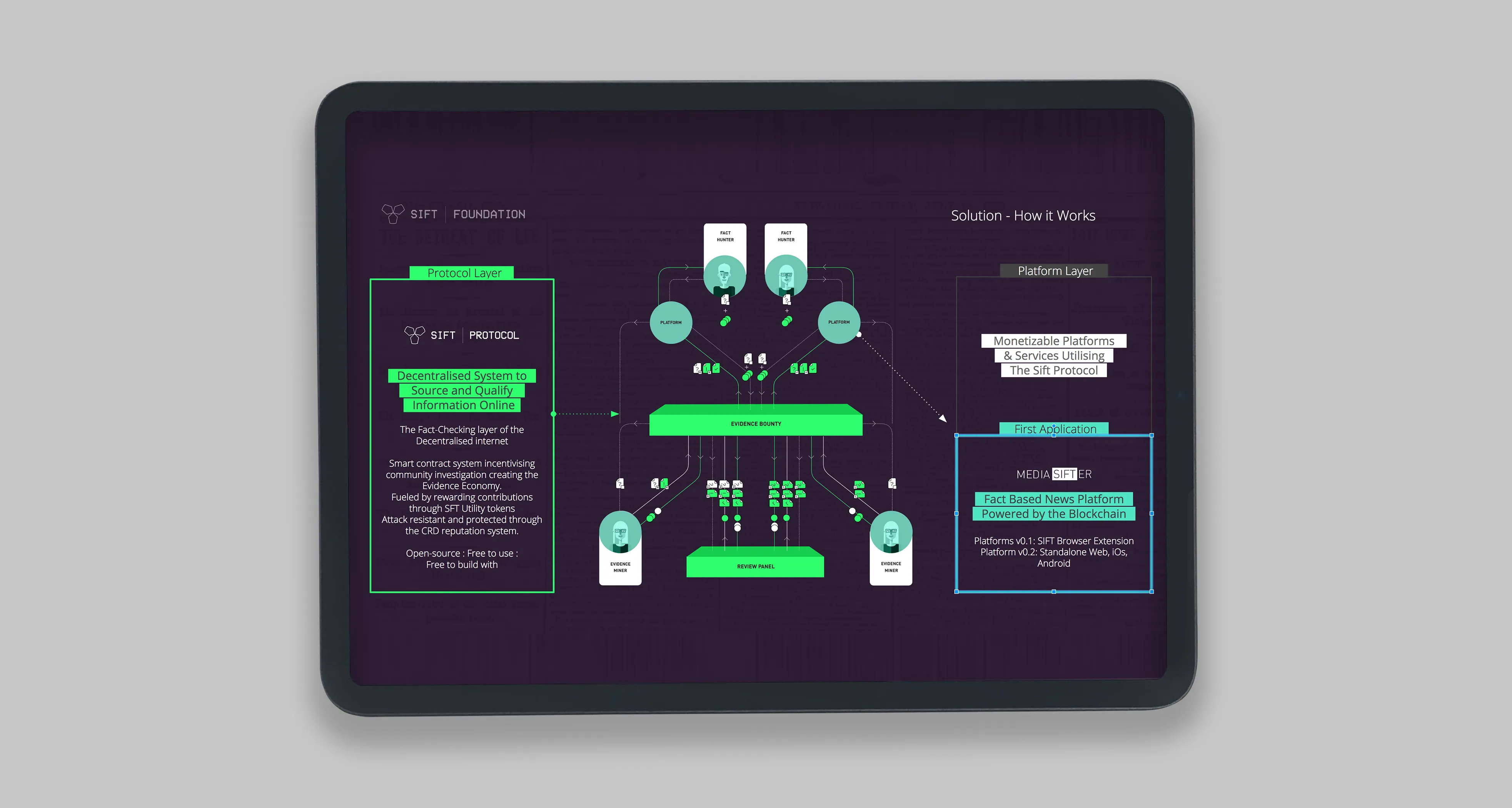
"A blockchain protocol to assist people in fact checking claims made on the internet. done via a decentralised and crowdsourced manner."
Brief:
The Sift Protocol is an open-source framework, which facilitates and incentivised sourcing of evidence for any question of empirical fact. All sourced from a global community of fact checkers and verifiers.
Role/s:
• 🔬 Behavioural Research
• 🆎 Written Content
• ✏️ Product Design (Protocol)
• 🔊 Branding & Marketing
• 💼 Business Model
• 🆎 Written Content
• ✏️ Product Design (Protocol)
• 🔊 Branding & Marketing
• 💼 Business Model
Process:
Phase 1
Conducted desk research to understand the various mechanism that can be used, also researched the various mechanism to incentivise and de-incentivise users
Conducted desk research to understand the various mechanism that can be used, also researched the various mechanism to incentivise and de-incentivise users
2015 | Object | 🧱 Sound Blocks
An musical instrument that assists learning in how sound fundamentally works
Brief:
What is sound made of? It’s a question that seems simple, but as we all know, the simplest things sometimes hide wonderful complexity. The challenge was taken first to understand what factors and aspects sound is created from. There are a lot factors, too many to be conveyed through language alone, in a short period of time.
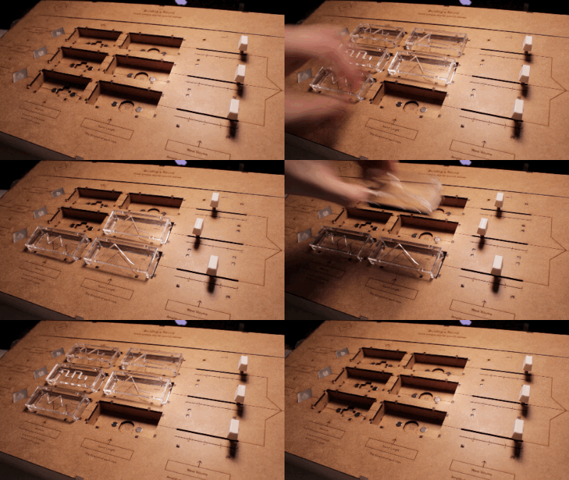
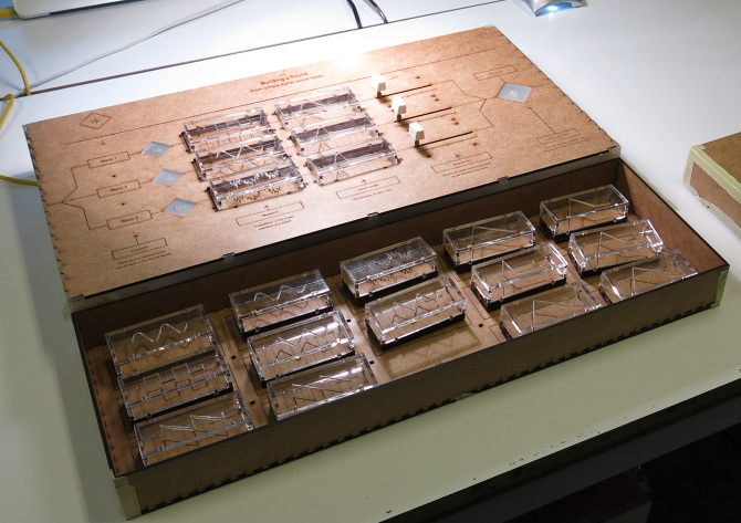
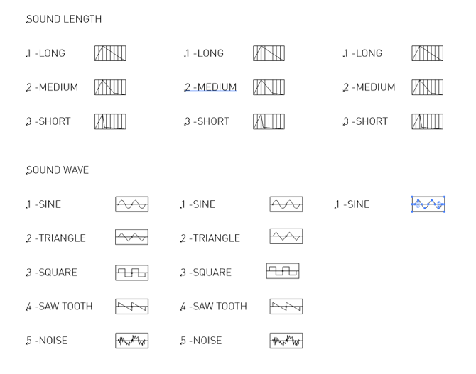
So the team created Sound Blocks, which allow people to learn how, with a few parameters, we can create new sounds, and, if desired, imitate real world sounds. It does this by letting the user control the waveform, sound decay, wave length, and volume of three channels, all mixed together. Sound blocks, first and foremost, was created as a tool to experiment with sound, it is playful and engaging. The goal is to help children and people of all ages better understand the basic elements that make up a sound.
How does it work:
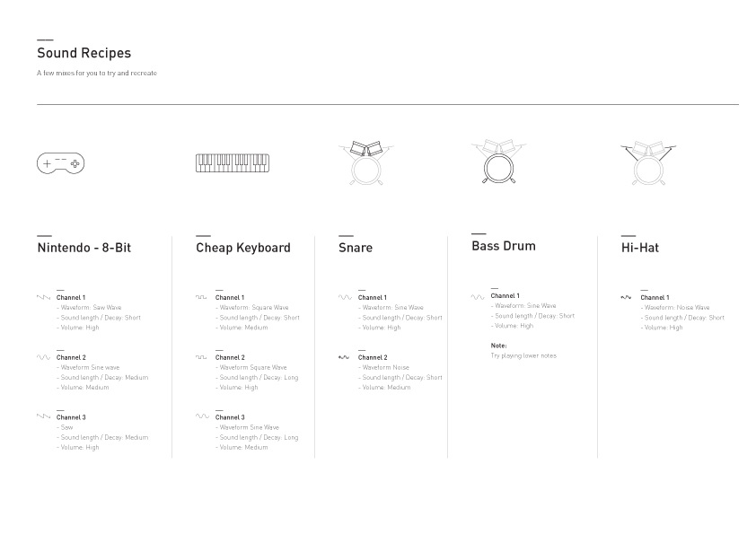
You are given three channels to experiment with. You can pick a basic waveform, the duration of the wave, and adjust the volume of each channel. It allows you to understand how synthesisers can emulate real world sounds, such as drums or a keyboard, with simple example recipes to get you started quickly.
The team’s lessons were plentiful. They learned a great deal about what sound is and the factors that make sound and musical sound exist. On the physical computing side, they learnt about circuitry and using resistances to differentiate objects. Each block has its own resistance value and thus can be used to trigger an exact reaction on another software, which in this case is Ableton Live. Coding skills were also required to identify, transform and send the signals into the sound software
Role/s:
• 📦 Prototyping
• ✏️ Product Design (Physical Product)
• 📽 Promotional Video
• ✏️ Product Design (Physical Product)
• 📽 Promotional Video
Process:
Phase 1:
We wanted to create a a device which taught how sound worked, so we broke it down into elements, from those elments we drafted a design for sound blocks
Phase 2
build, we spent a large amount of time laser cutting soldering and hooking up the device to Ableton
Phase 3
Promotion we created a promotional video
Achievements:
• ✏️ Designed, laser cut and assemble the full product
• 🎖Finalist for IXD Awards
• 🎖Finalist for IXD Awards
📝 Summary
Entrepreneurial product designer, focused on helping organisations achieve their business goals through elegant and thoughtfully considered design solutions. 16 years of experience in product design. Comprehensive skillset including user research, low to high-fidelity design, prototyping, product and team management, and low-code development. Worked with established organisations such as Samsung Design Europe, World Health Organisation, BBC, Mozilla, EA Games, and numerous startups, including my own such as Sifter.
✉️ Get in Contact
If you are looking to get in touch, you can reach me at:
Thank you! Your submission has been received!
Oops! Something went wrong while submitting the form.


